


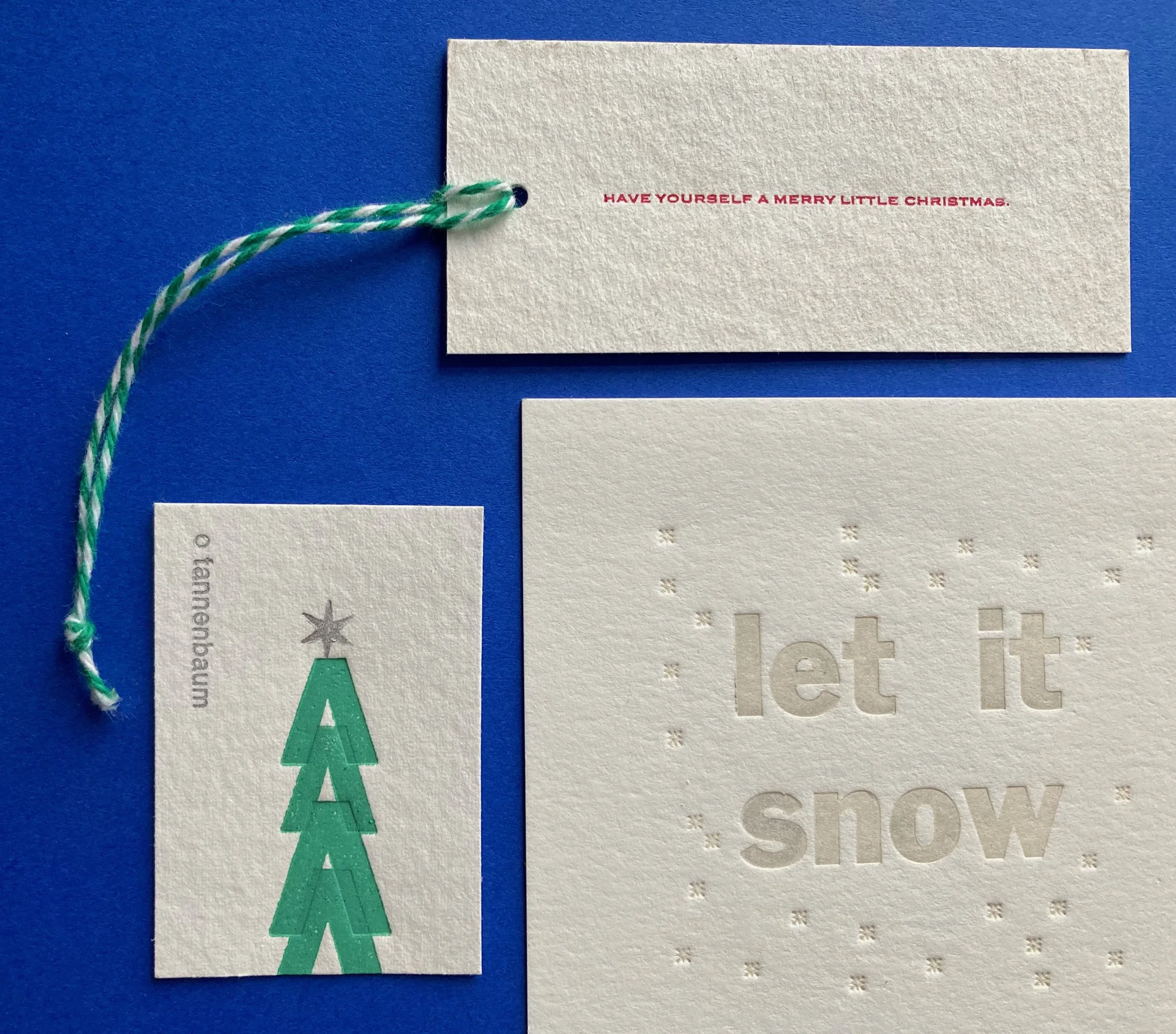
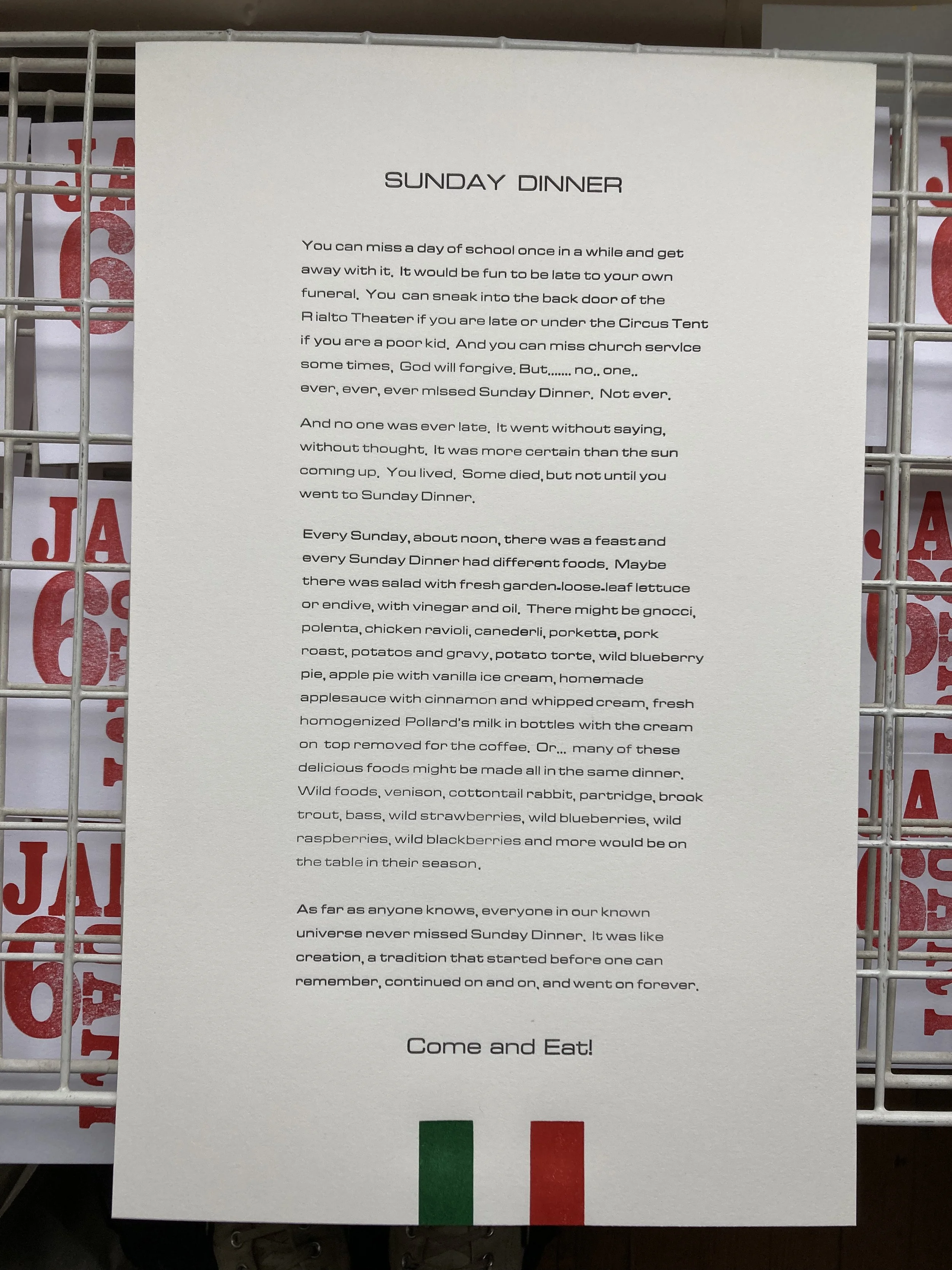


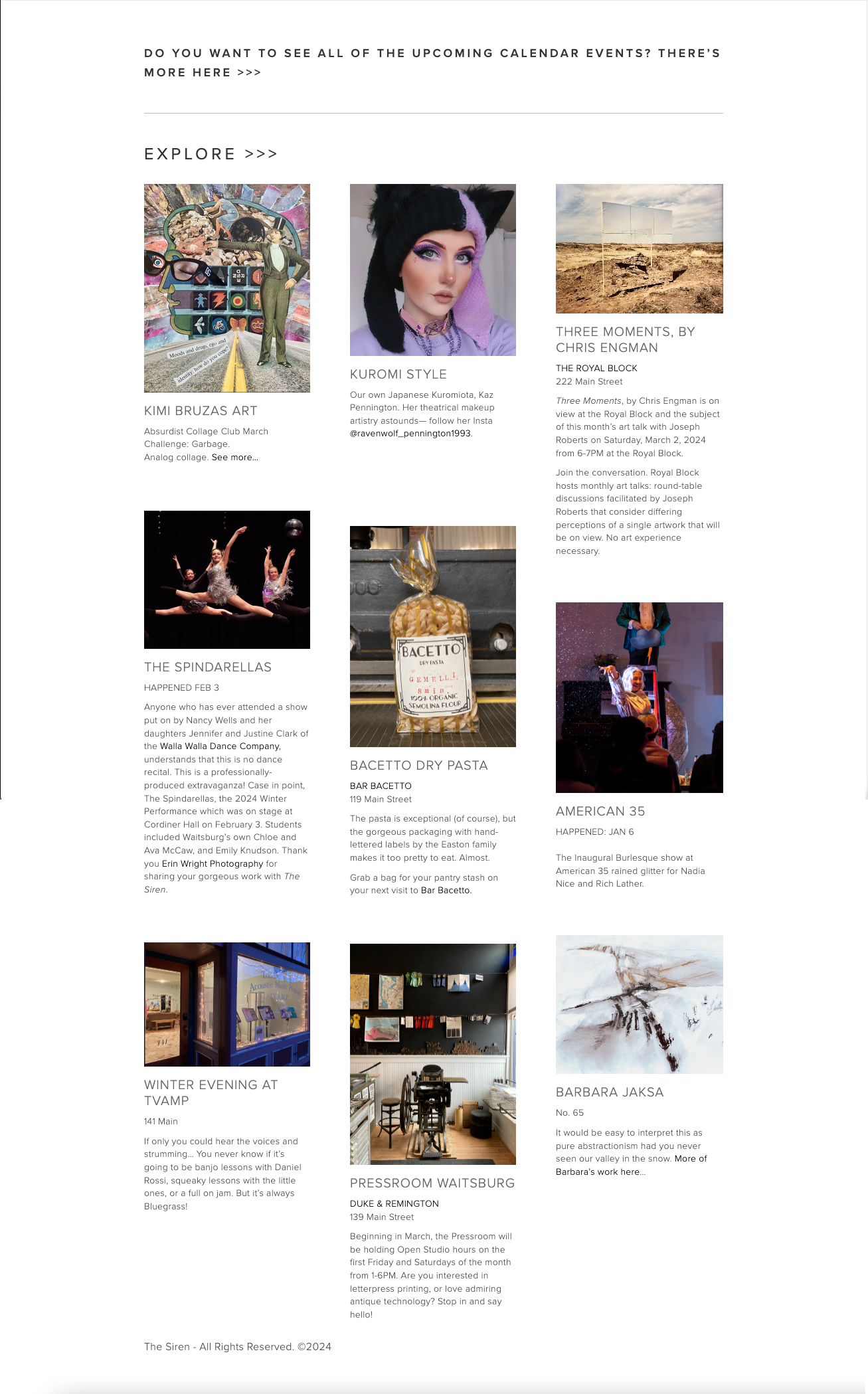


THE SIREN
BRANDING / WEBSITE /
PASSION PROJECT
thesiren.org
The Siren is a pet project of mine, to highlight the many artists, makers, and businesses of our town. Named for the Sterling M-5 Air Raid Siren which blares at noon Monday-Friday, as well as the siren call of Waitsburg to those seeking a life less ordinary, the branding was simple.
The top priority was to create a unified events calendar, an index of businesses, and pages built to inspire exploration of the art, craftsmanship, music, and community activities.
On pages where image content is displayed, we keep the branding quiet— almost imperceptible to avoid interference with the art or branding being featured.
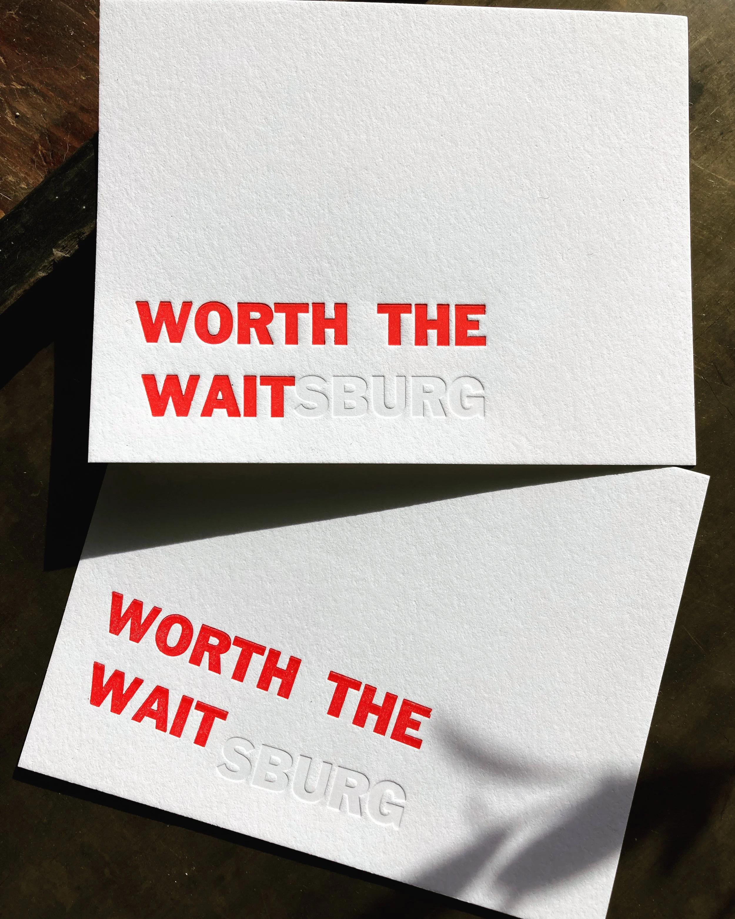
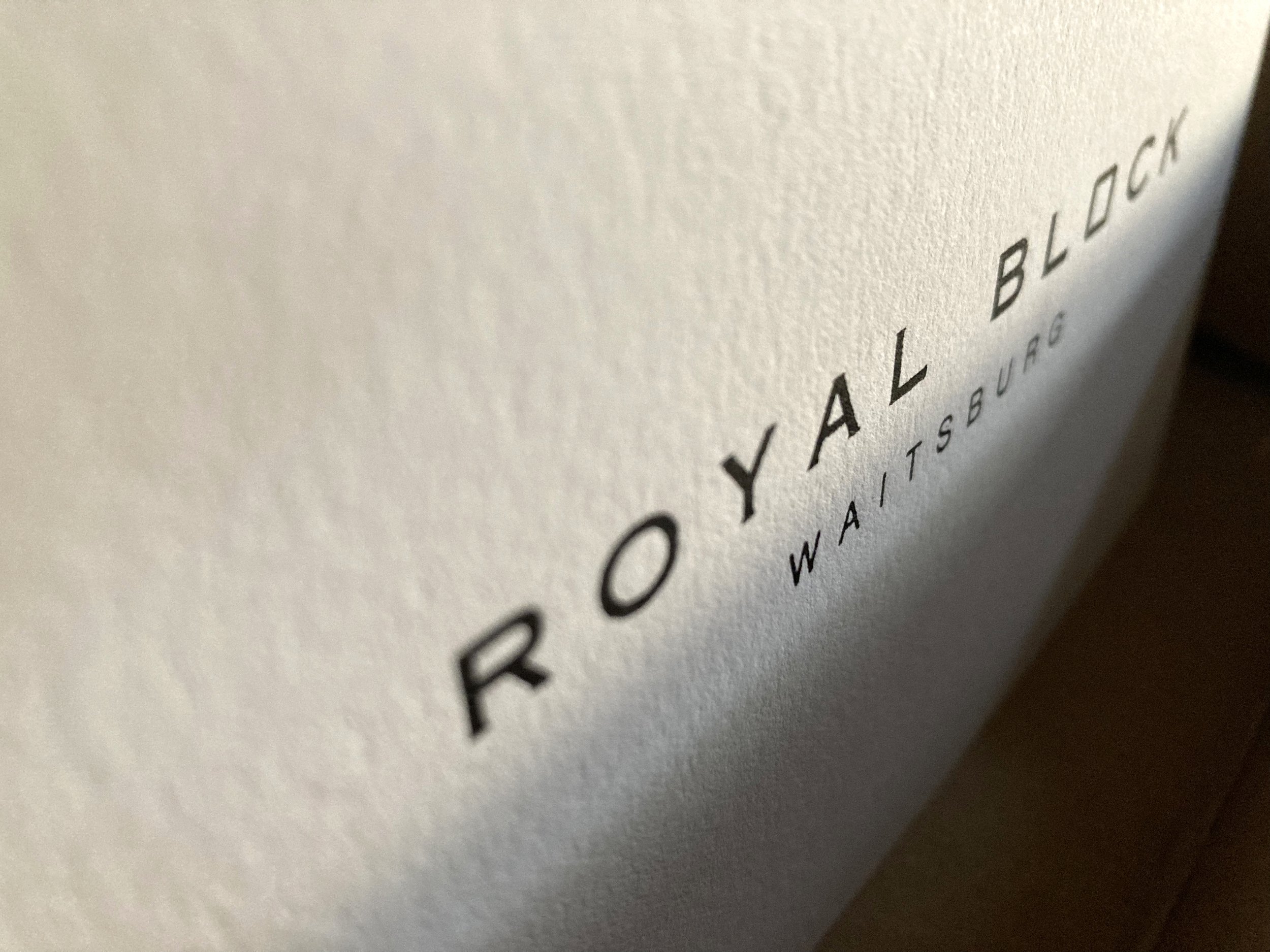
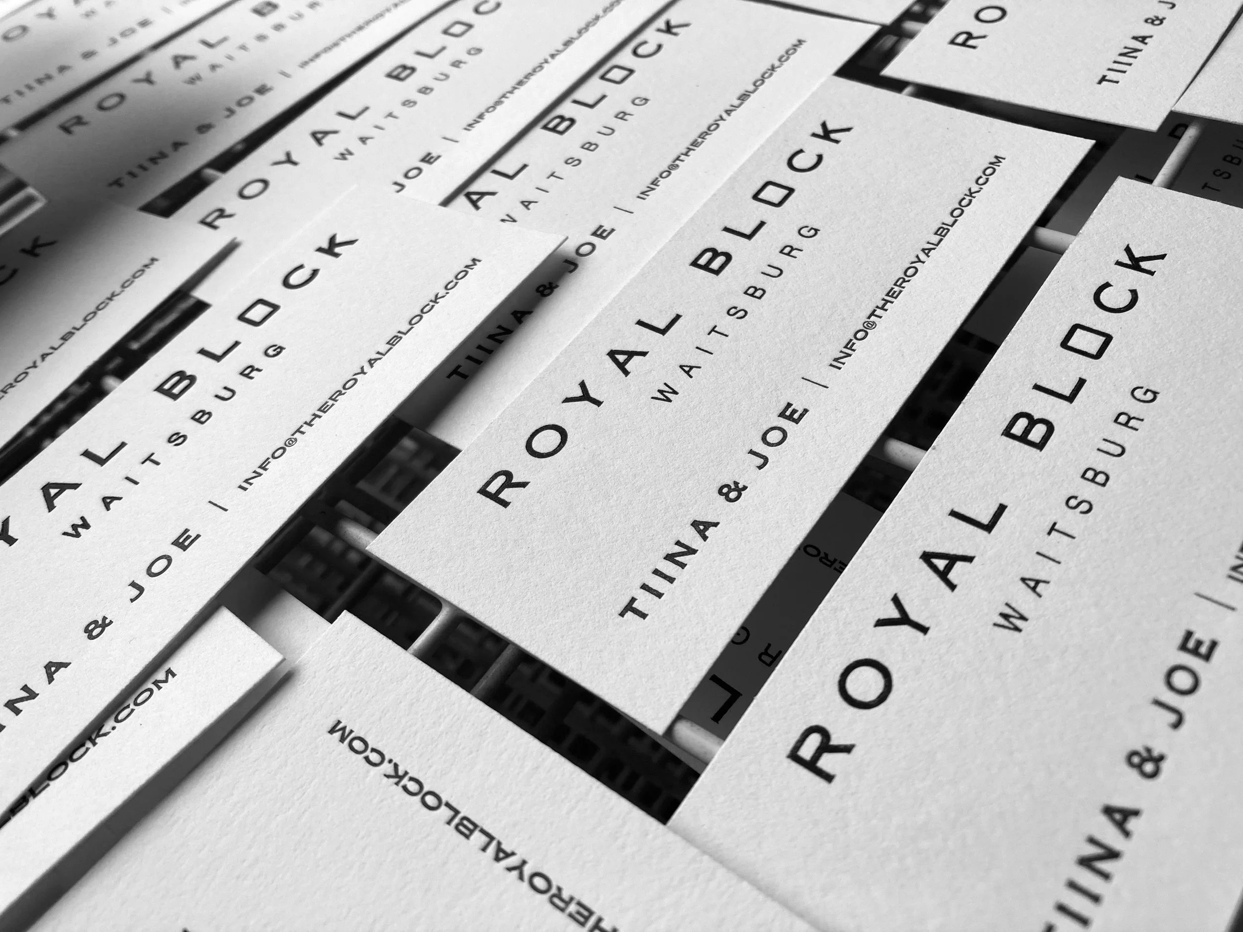
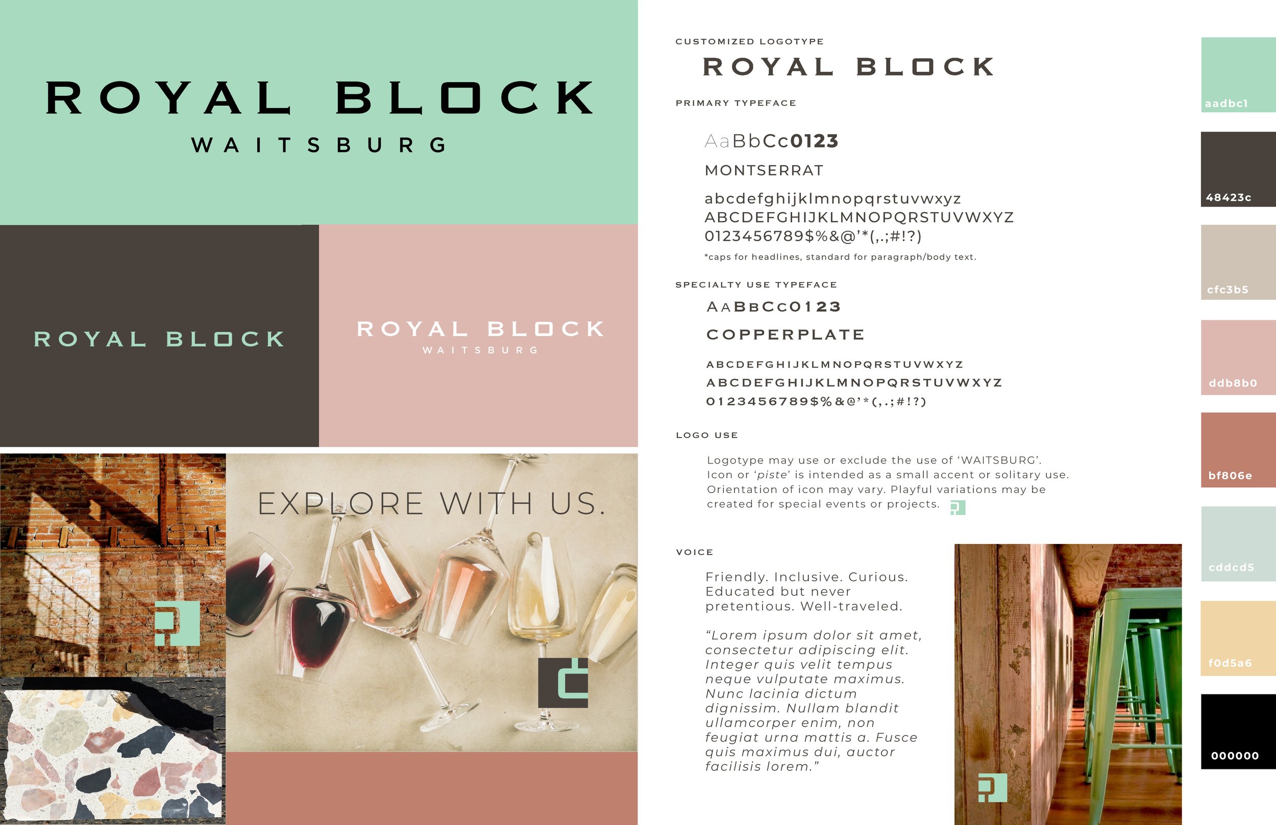
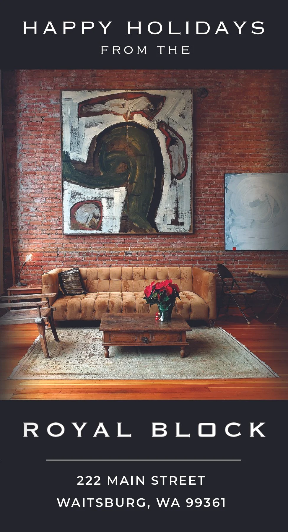
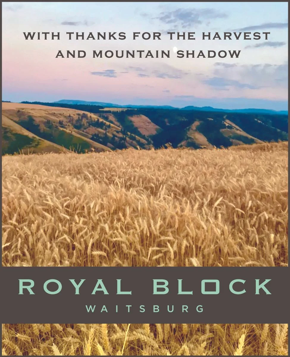
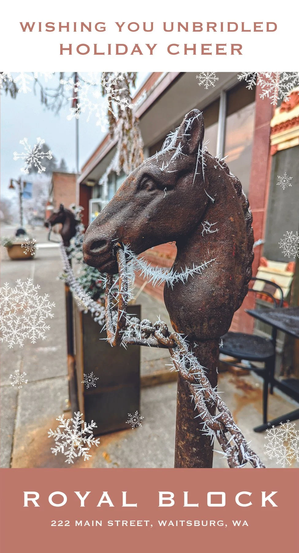
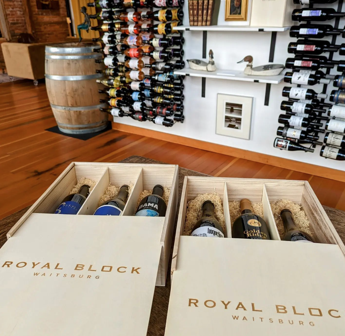
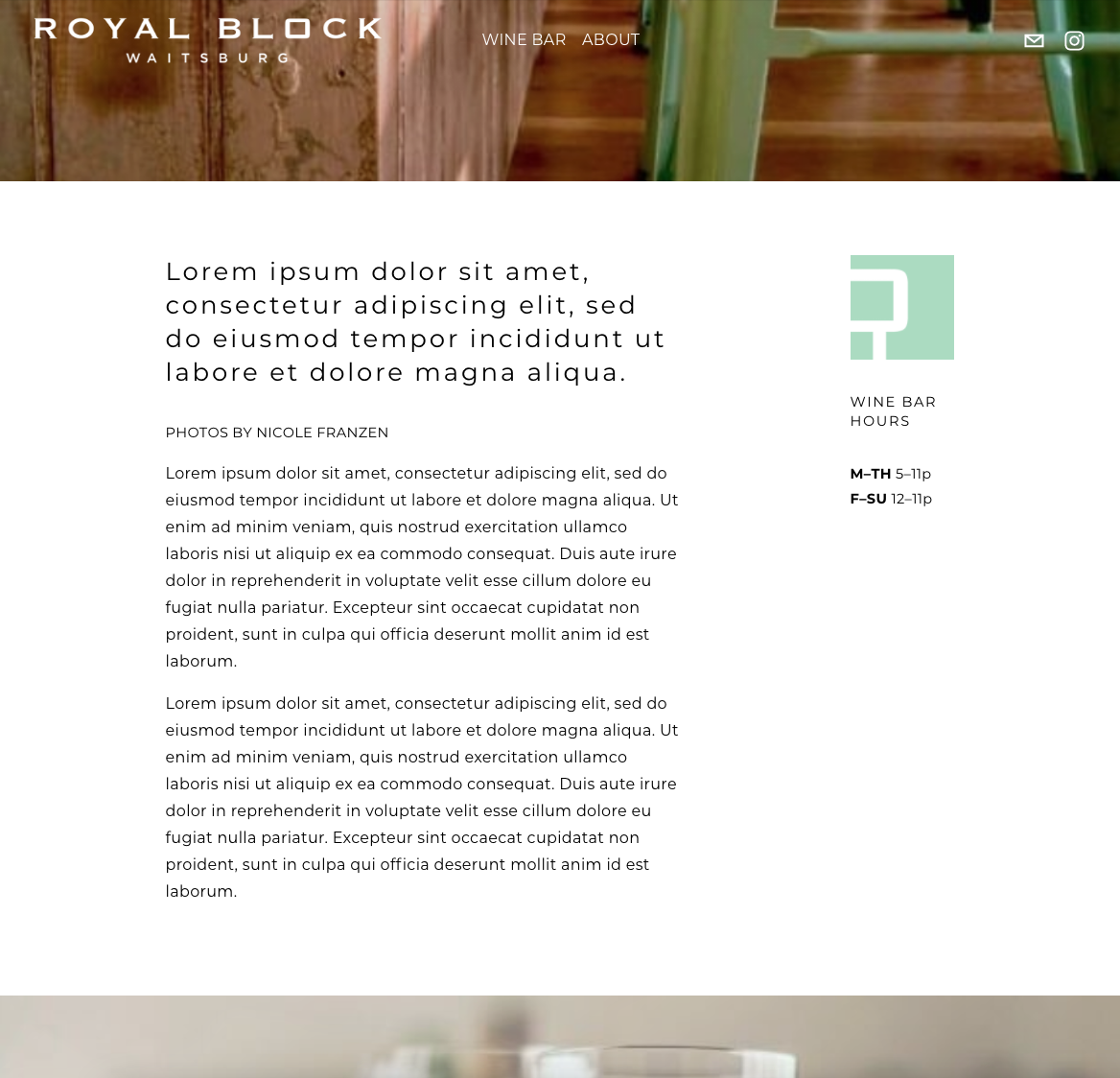
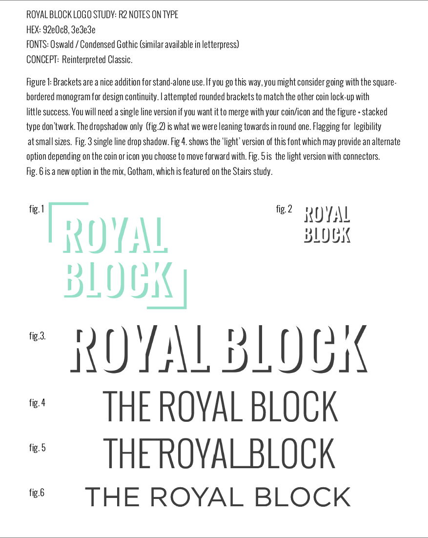
THE ROYAL BLOCK
BRANDING | INITIAL WEBSITE BUILD | ADVERTISING ADS & TEMPLATE
theroyalblock.com
The Royal Block Project was a delightful exploration of concept and search for an authentic brand identity that captured the vision of the Royal Block’s two owners.
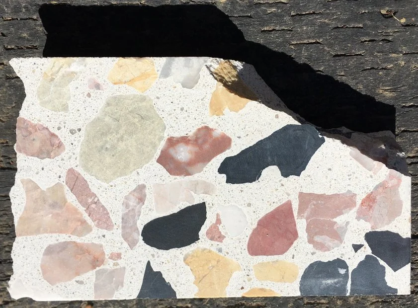
The palette was simple to lock in, with a beloved pick-up truck paint color dictating the minty jade hue, the blackened iron of the bar and trim, antique brick of the property walls, and color sampling from the tiles and colorful modern aggregate flooring.
The logo and icon was determined through full exploration and revision cycles, and the font styling narrowed by the request that the logo font be selected from the antique type available in the cabinets in the letterpress studio across the street.
A high point was watching the lively debate between the two owners, about the proper orientation of the piste/icon. To this day, I don’t believe that point has been resolved.
The original website was simple, and architected to provide basic information until renovations were completed, and further website development could be tackled in-house.


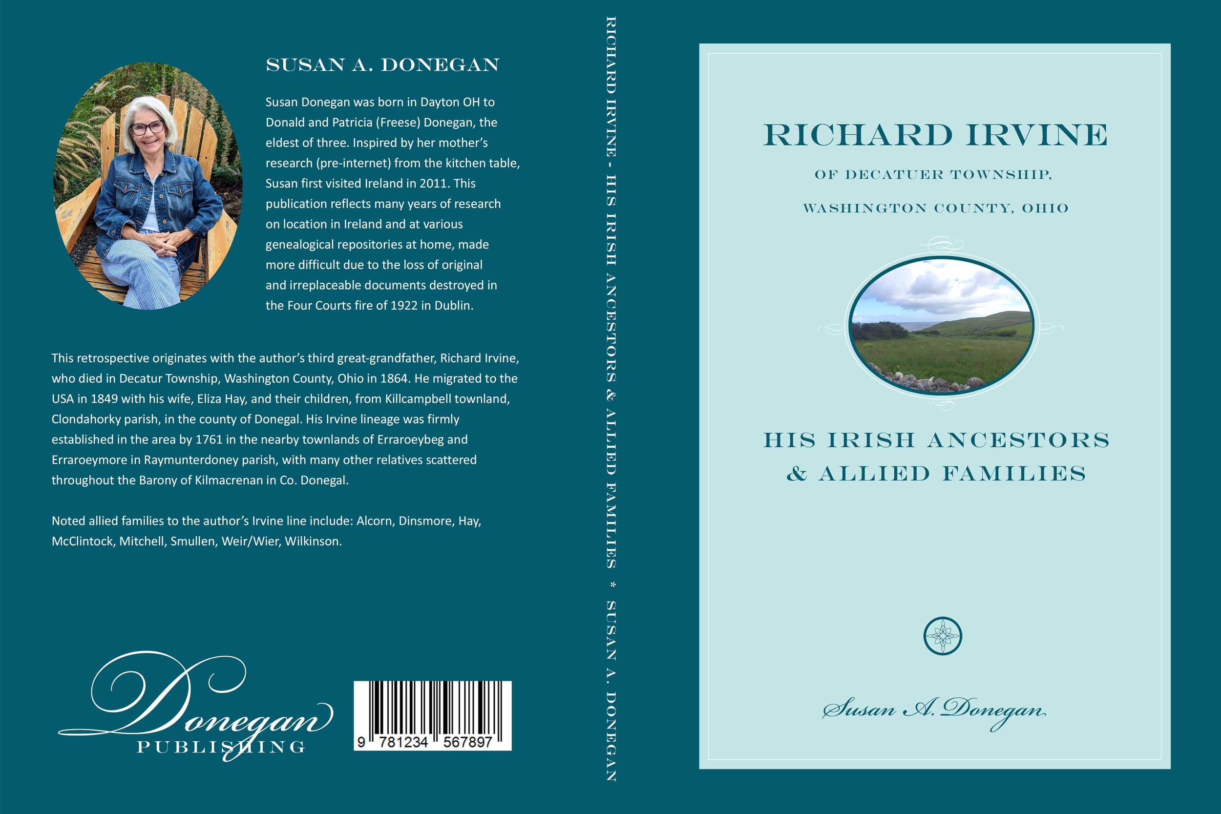
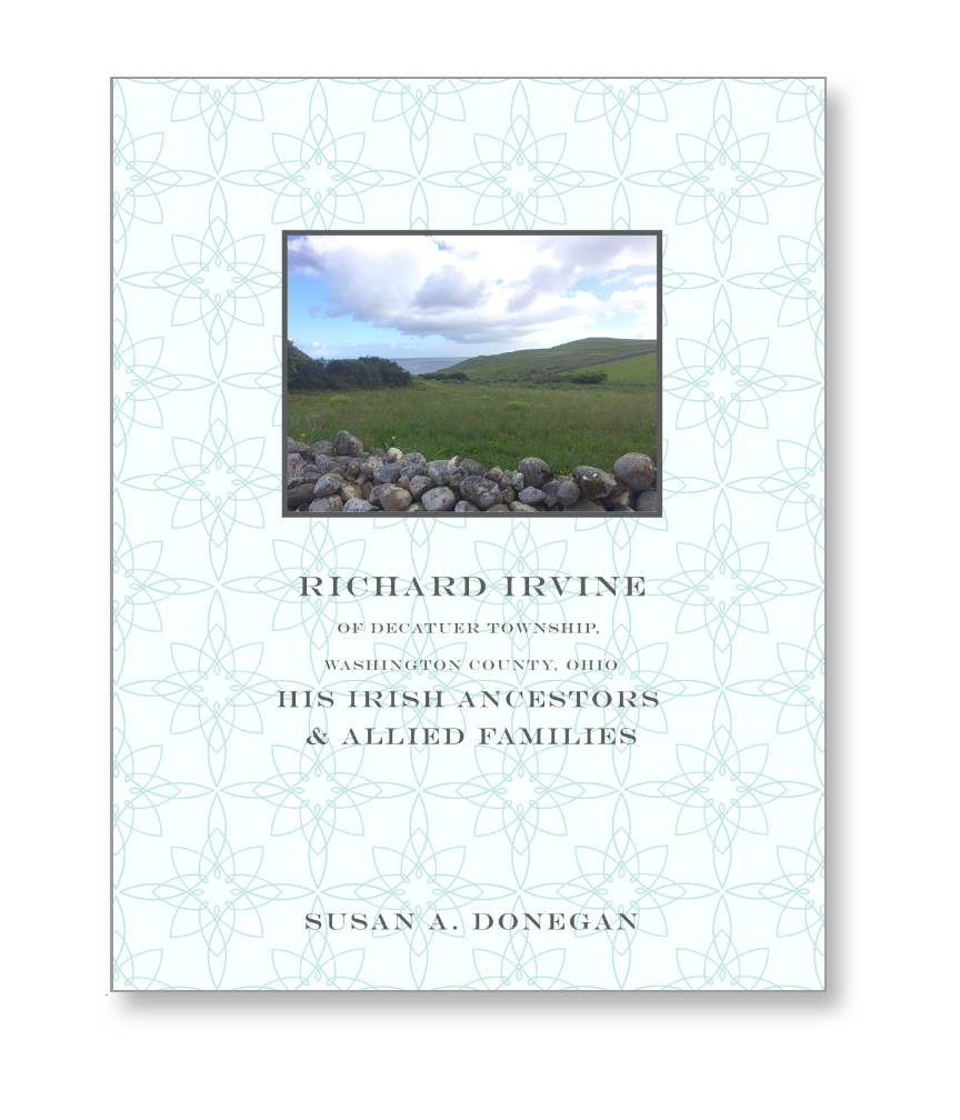
DONEGAN PUBLISHING
BRANDING / COVER ART / BOOK DESIGN (PHYSICAL + E-BOOK) / INITIAL WEBSITE BUILD
doneganpublishing.com
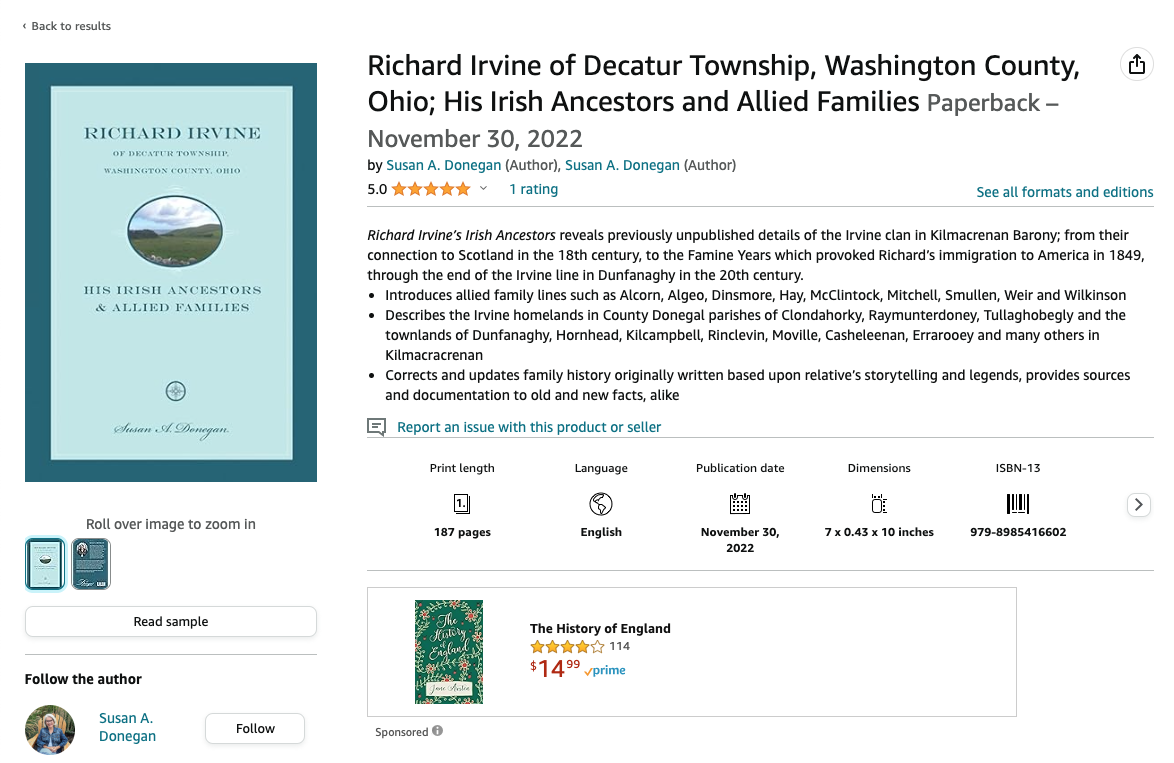
This project was executed to support the launch of Susan Donegan’s family ancestry research, and was a delight for her clarity in knowing exactly what she wanted.
The knotwork was a reference to her Irish heritage, and originally included elements of the rose compass which was very meaningful to the author. She has dabbled in calligraphy, so script was a natural choice for the branding font, supported by a more legible . The robin’s egg blue was chosen from her favorite paint swatches, and you’ll note some testing between two subtly different shades.
One of the challenges was sorting out how to use a very low resolution photo that she had taken with her phone of her family’s original Irish homestead site while on a research trip. Thankfully, adding a filtered texture did the trick.
The E-book sells directly from Donegan Publishing’s e-commerce enabled site, while the printed version is sold on Amazon.com


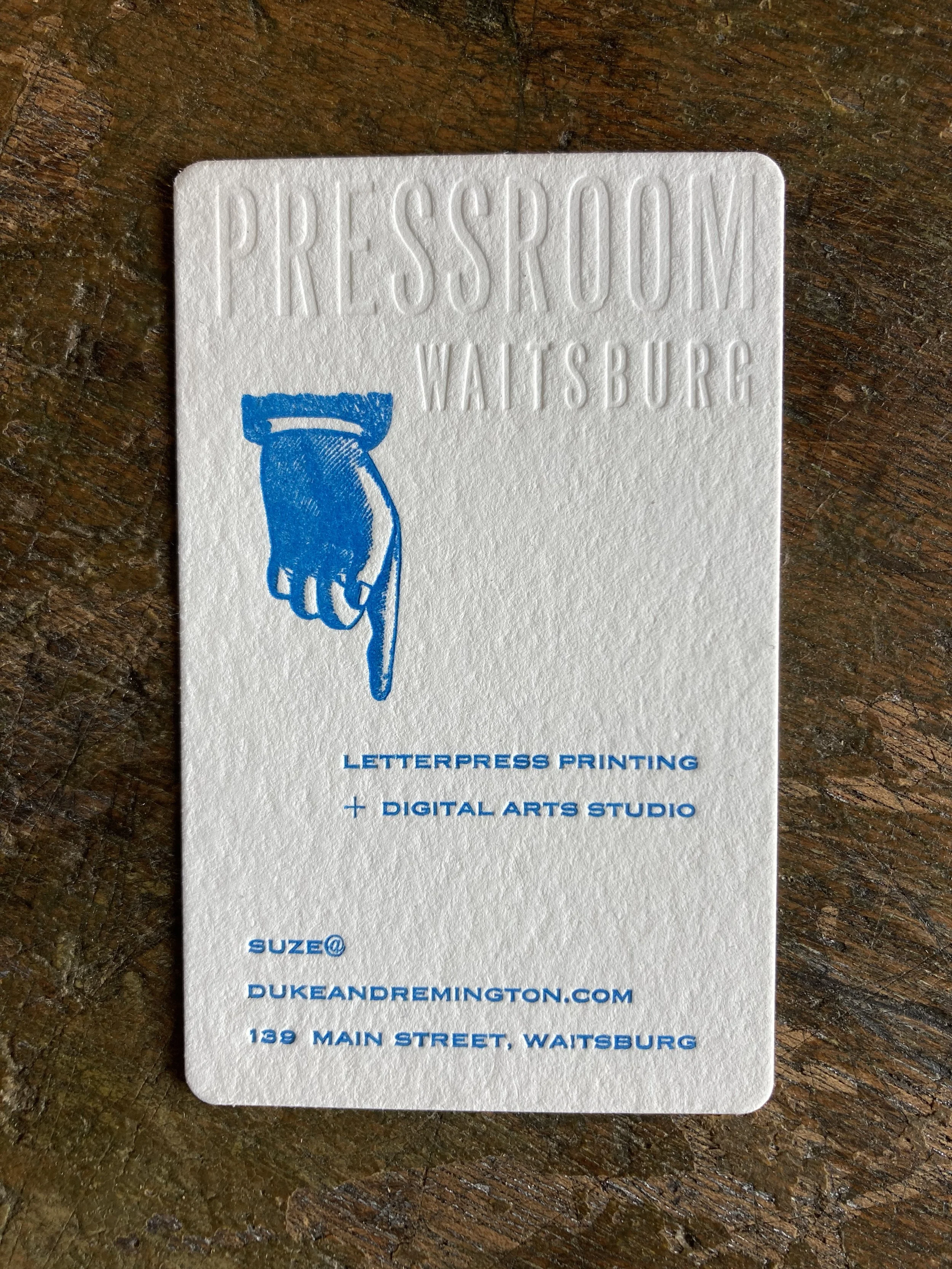
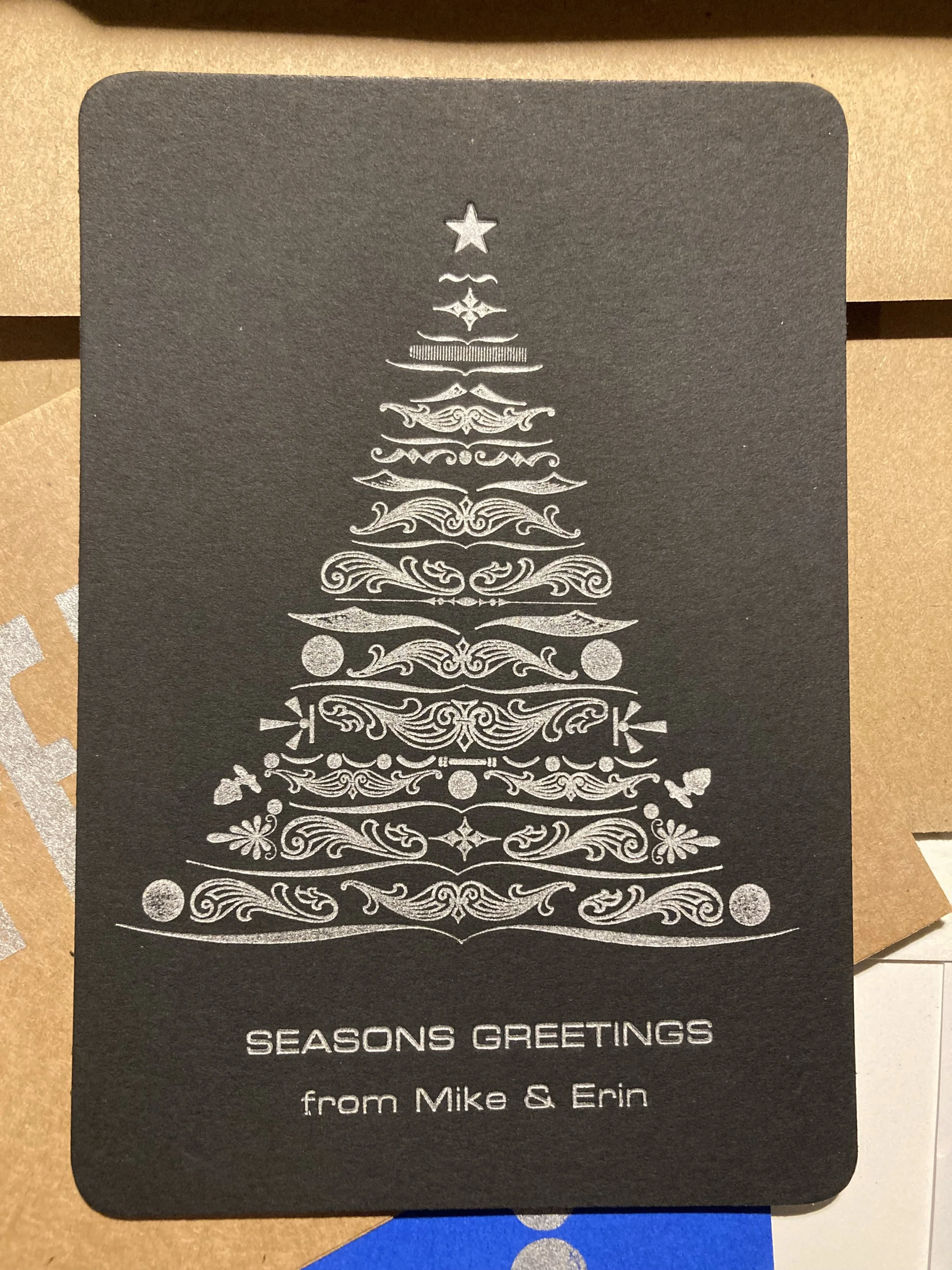
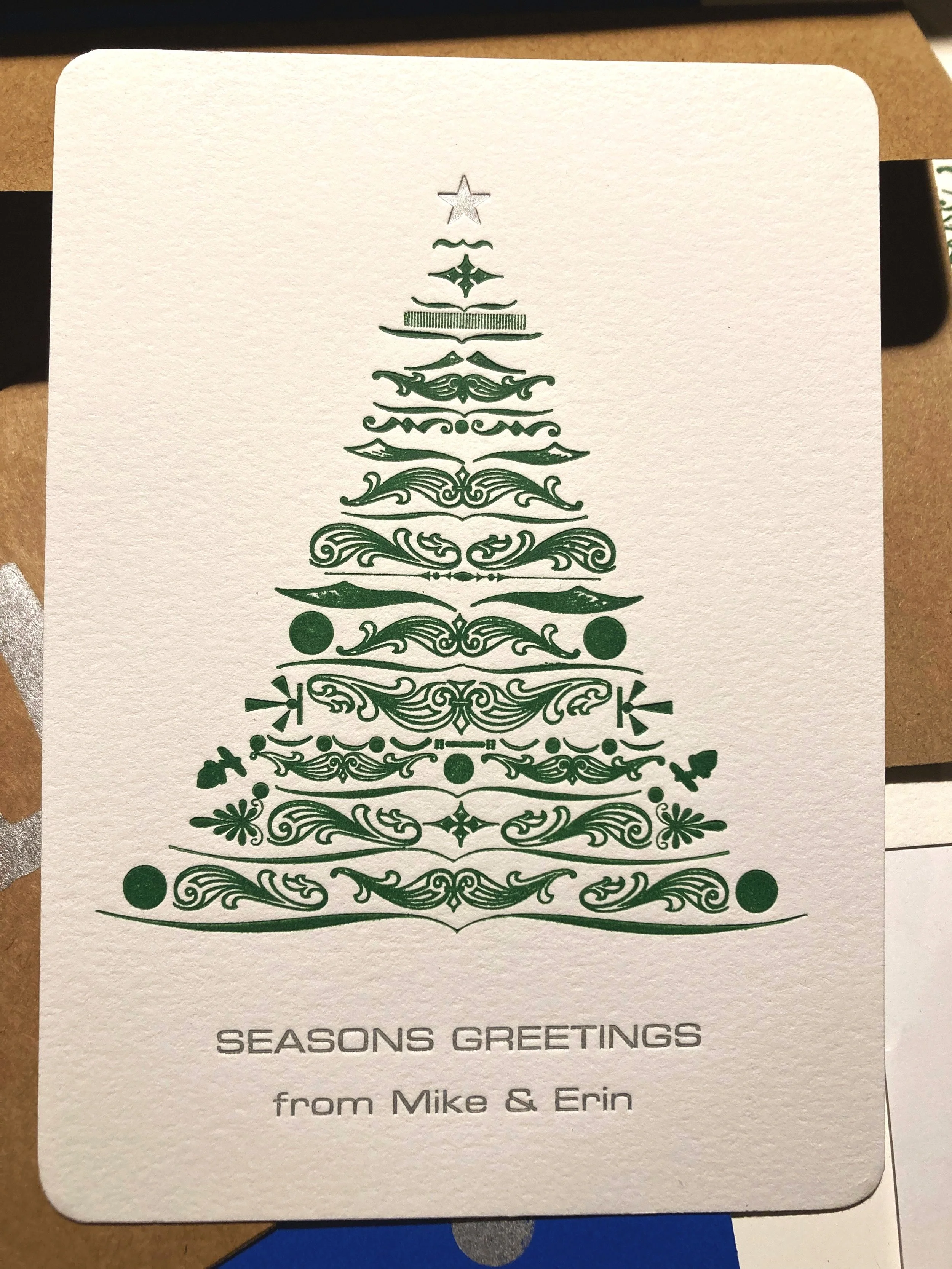
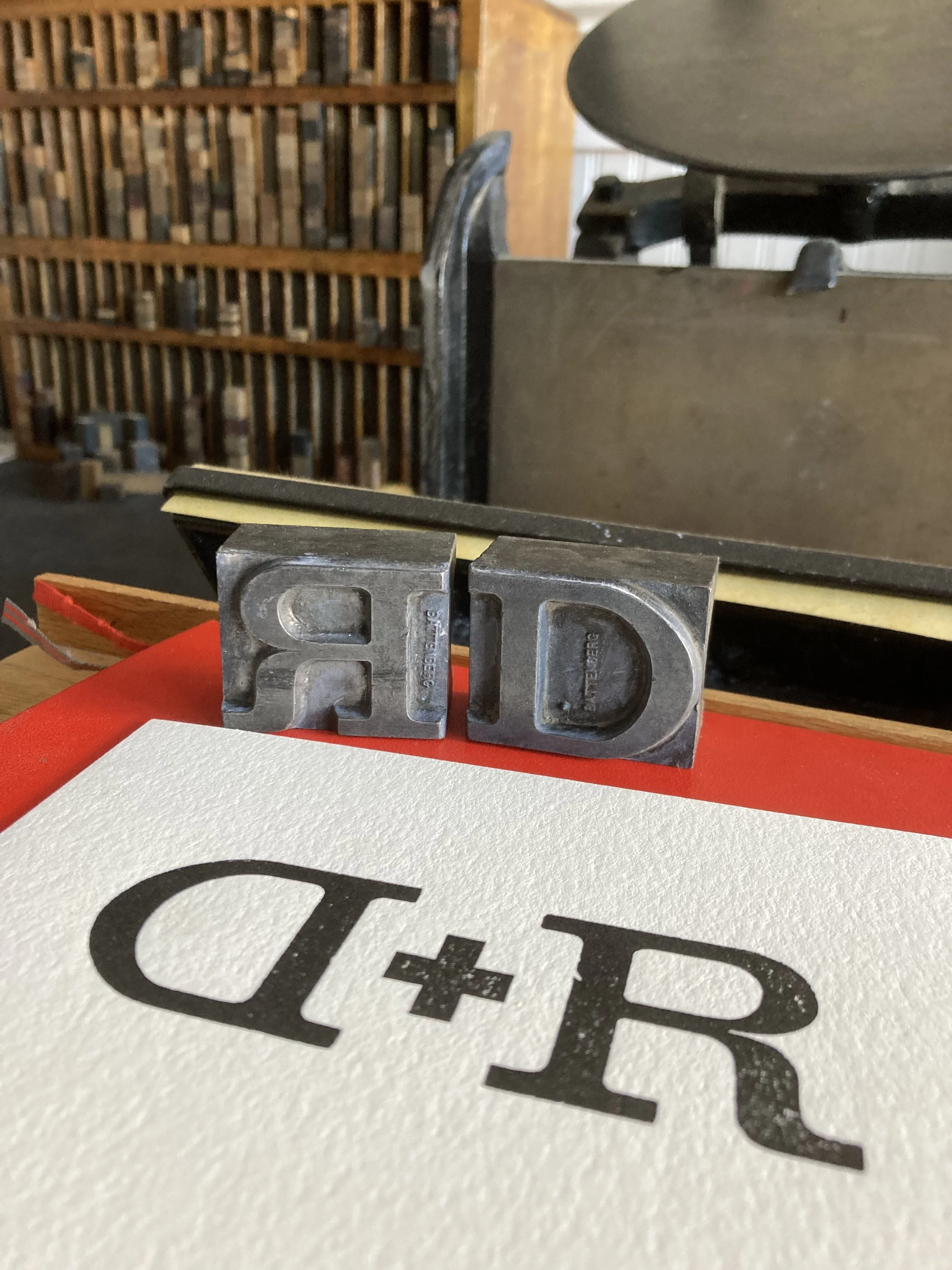
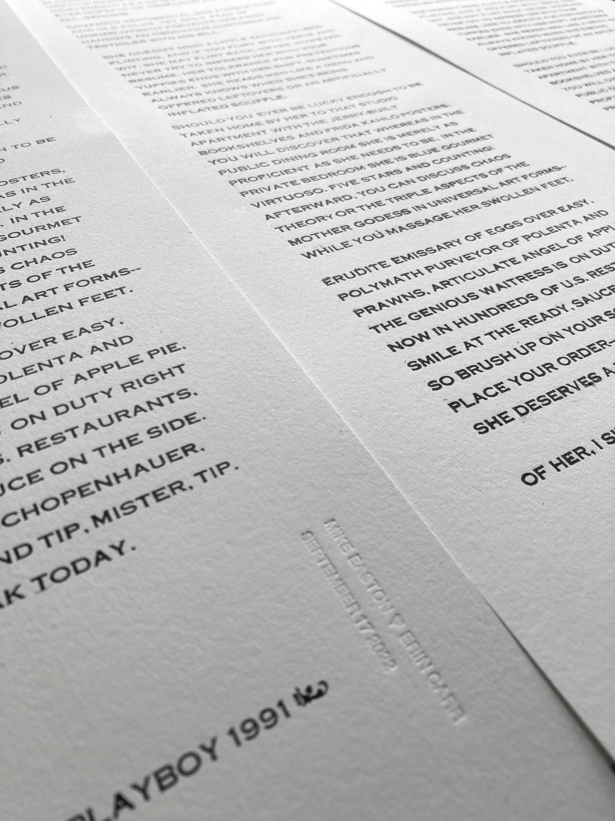
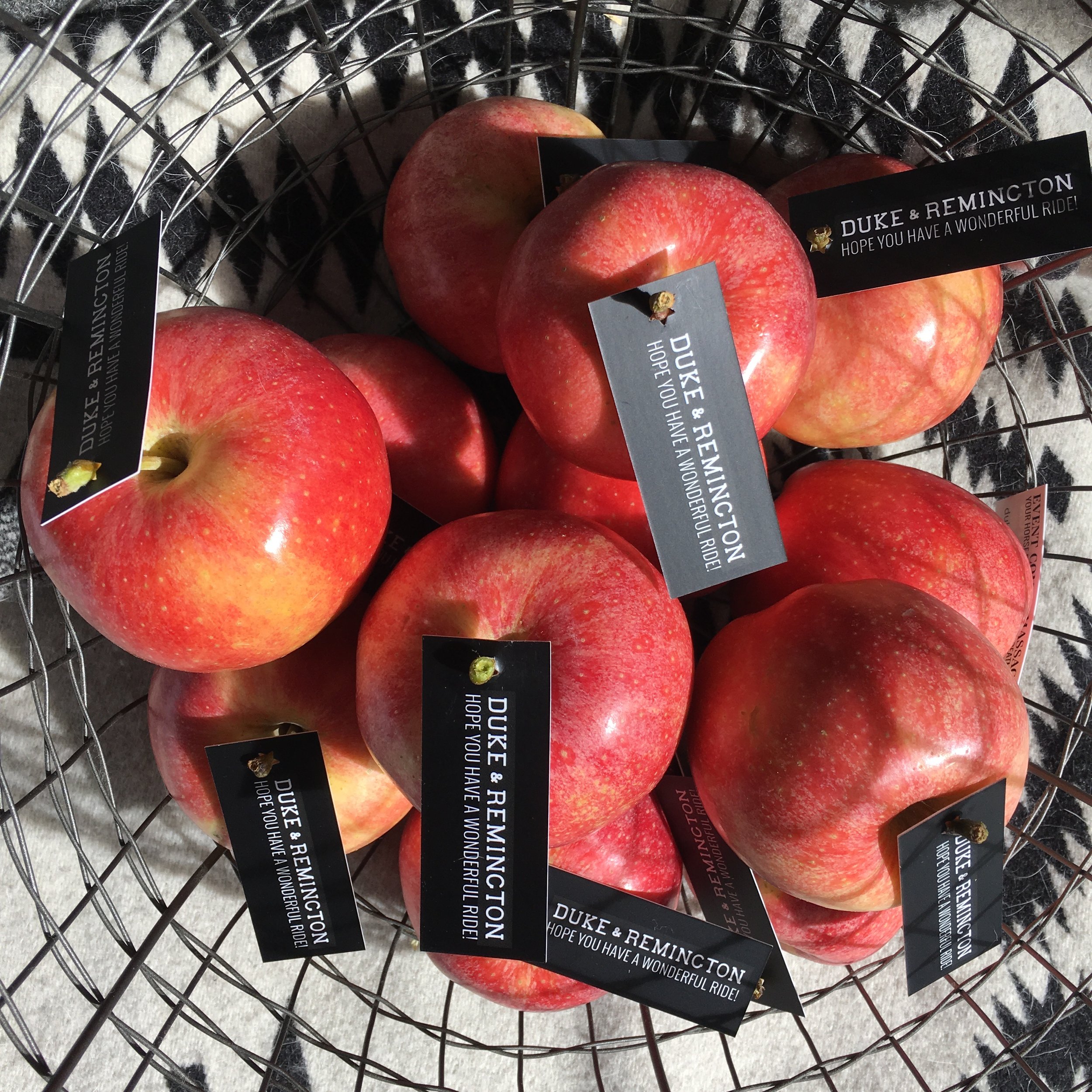
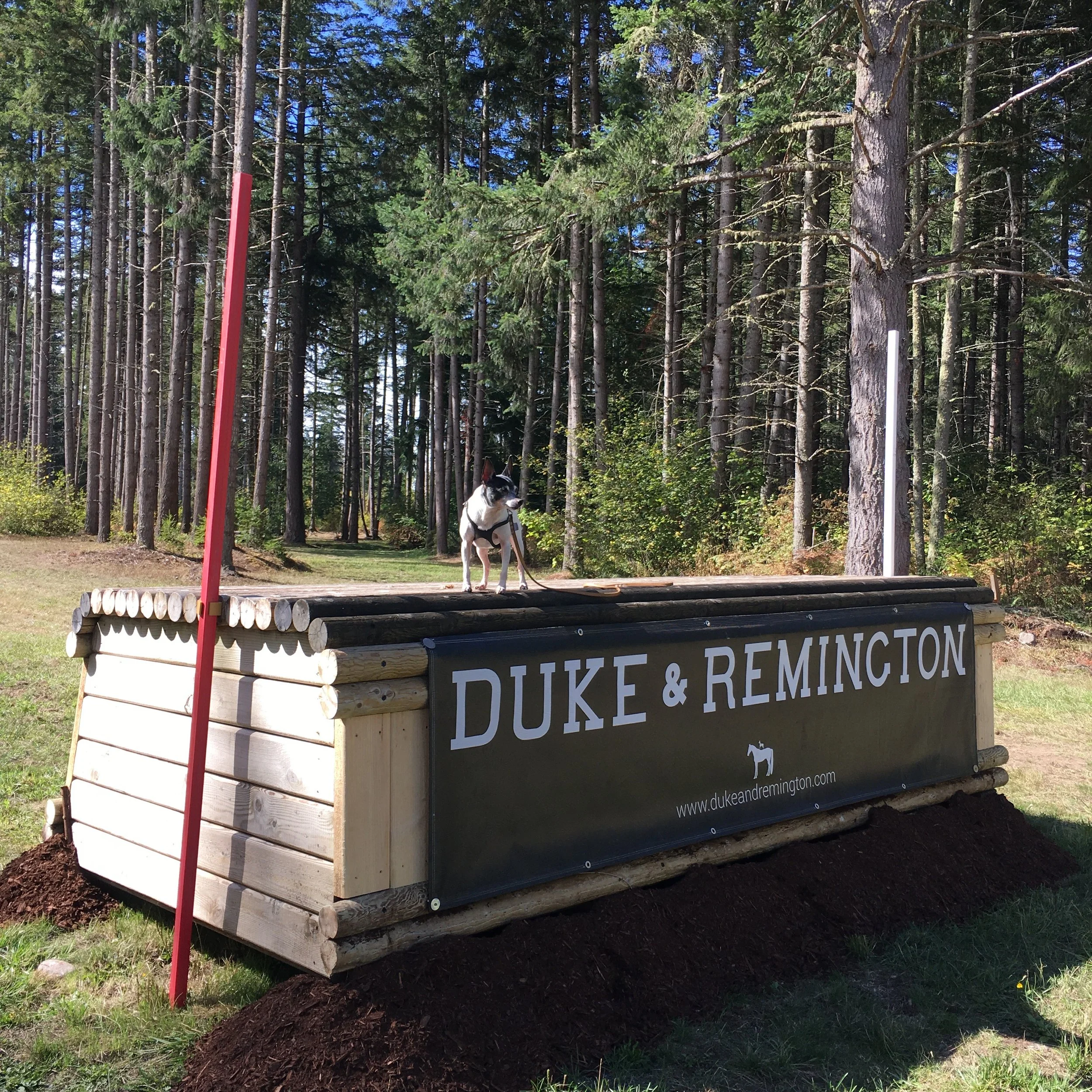
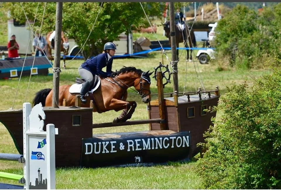
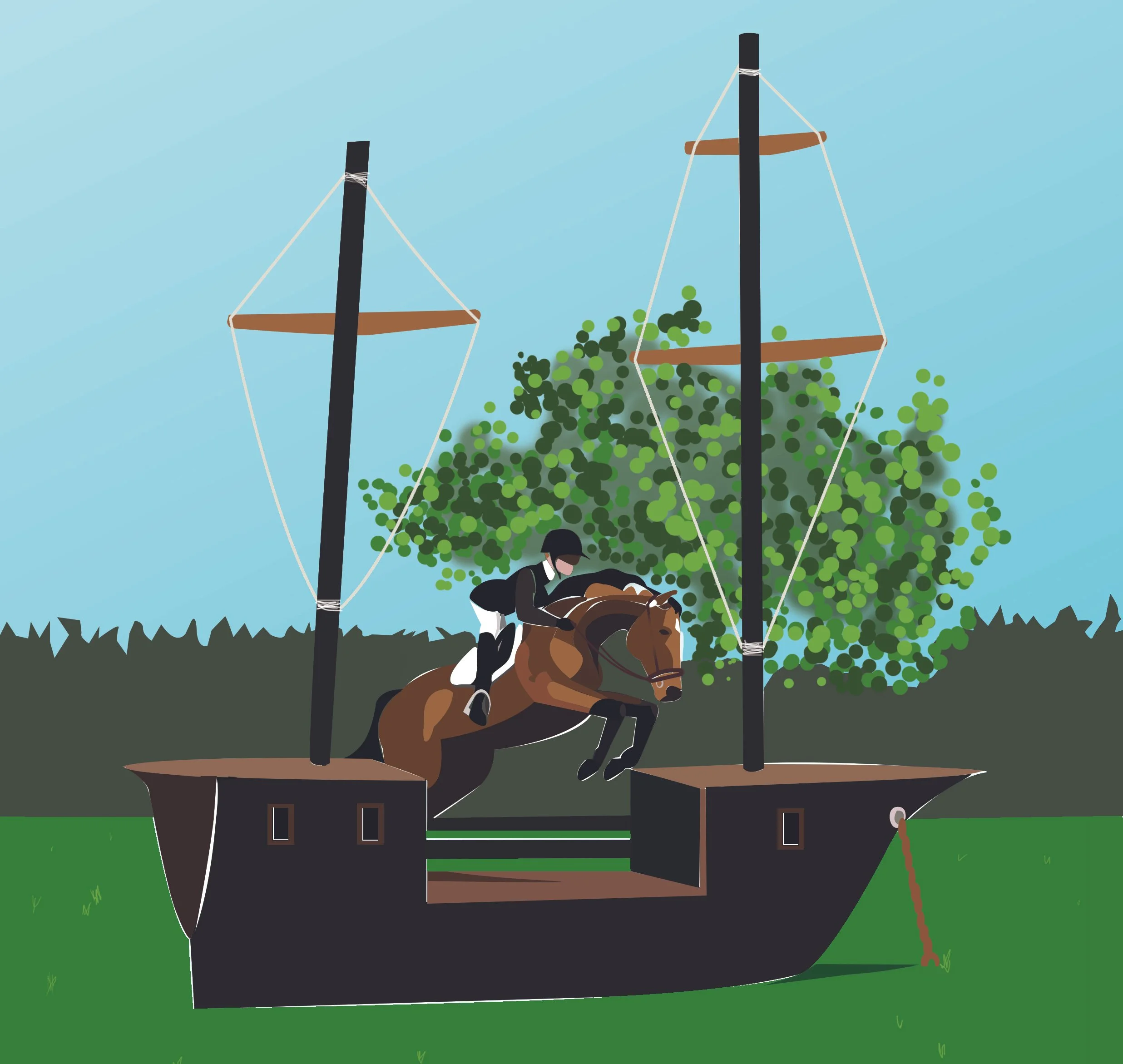
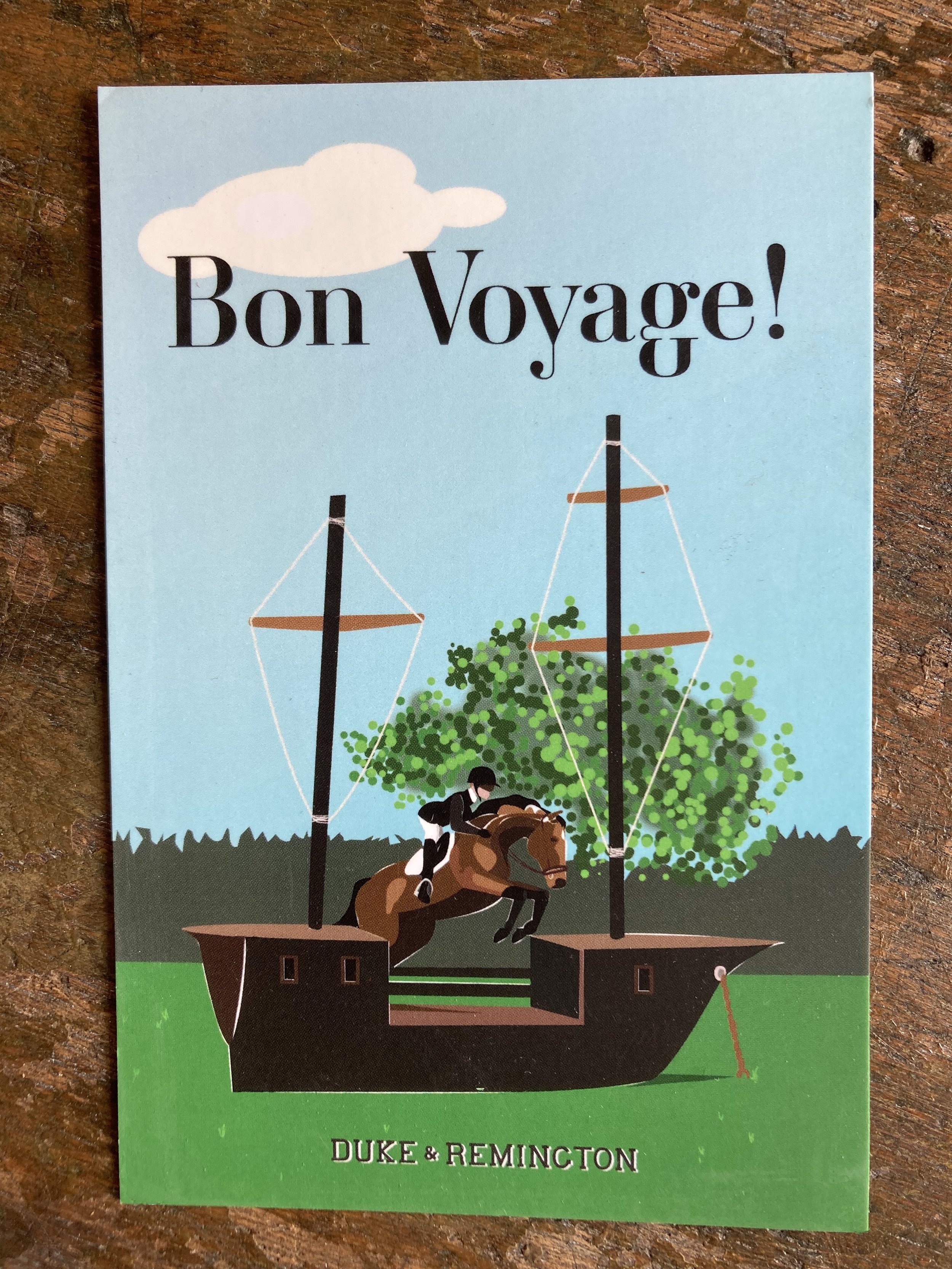
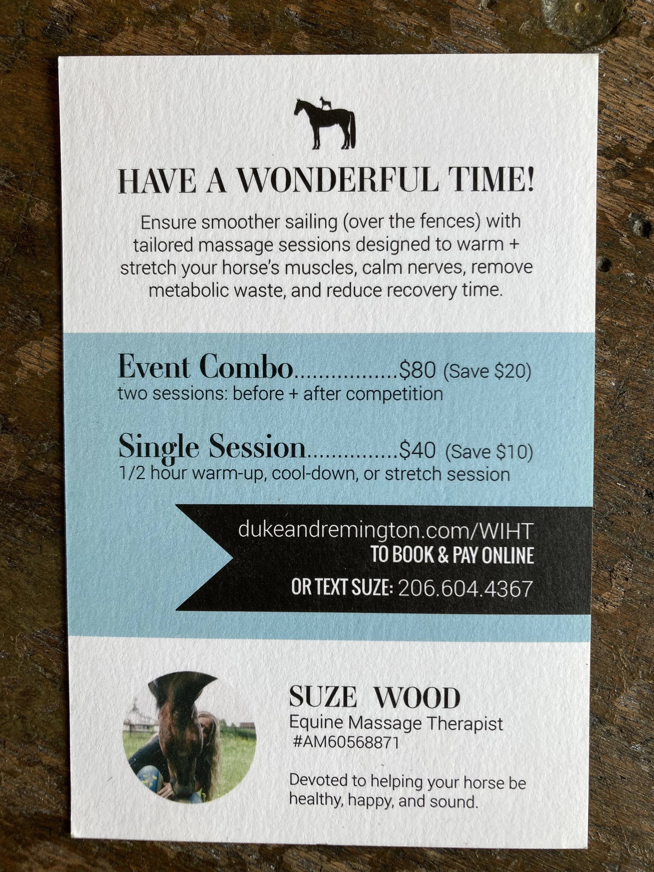
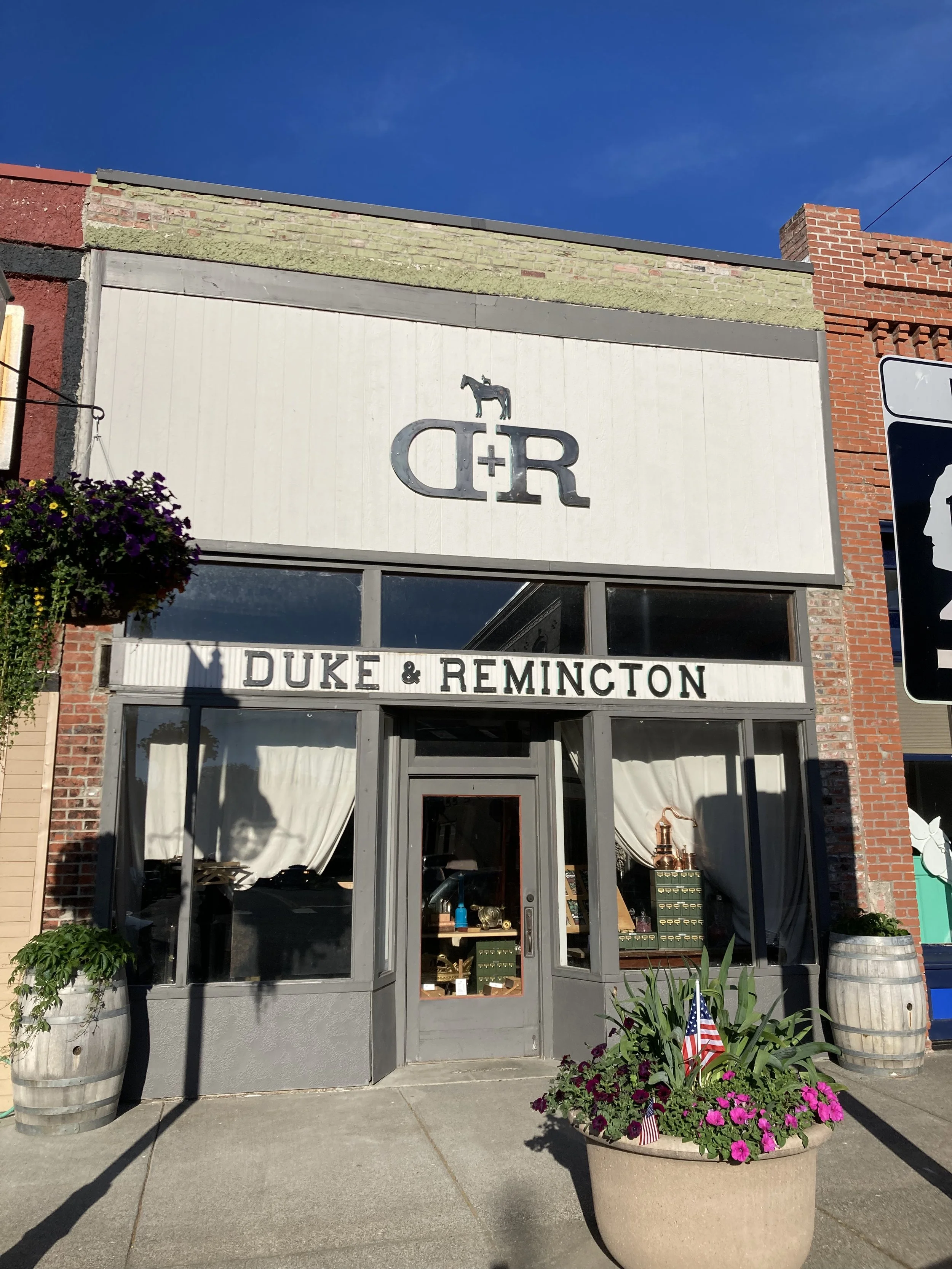
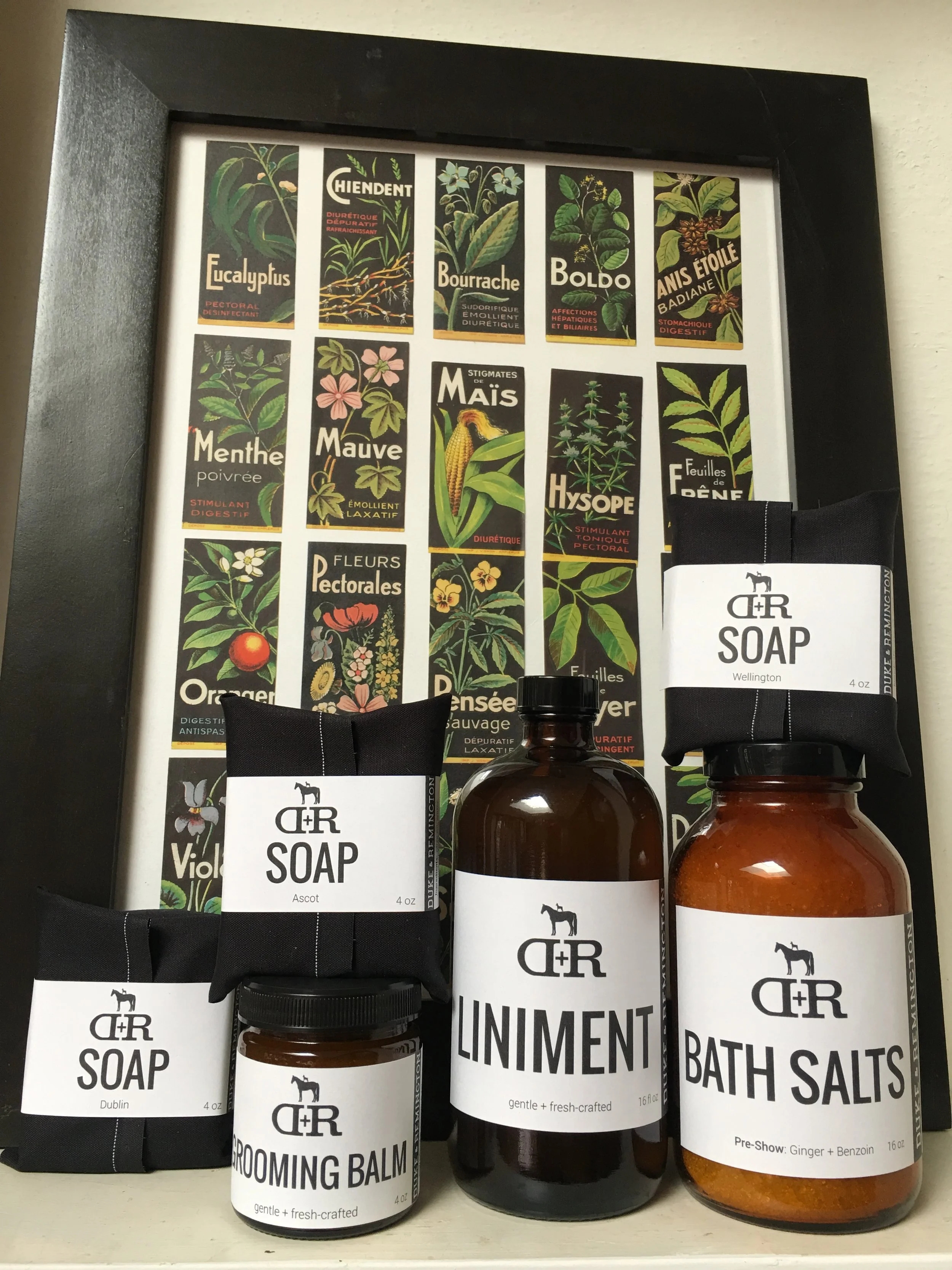
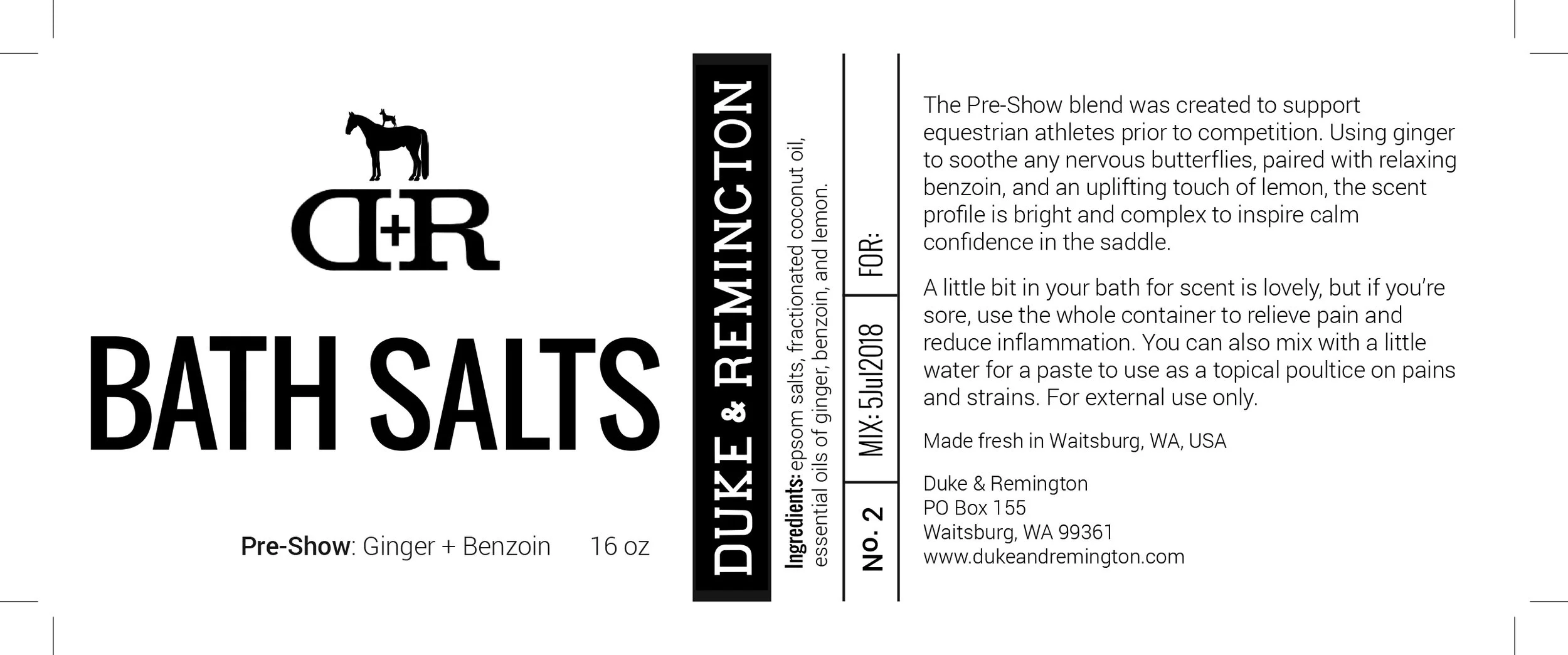
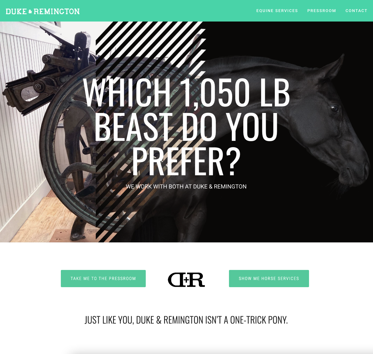
DUKE & REMINGTON
BRANDING / ILLUSTRATION / PRINT/ WEBSITE / DIGITAL ACUPRESSURE GUIDES / SIGNAGE / PACKAGING / SOCIAL PROMOS
dukeandremington.com
Named for the two animals that changed my world, Duke & Remington now encompasses equestrian services, the Pressroom letterpress and digital design studio, as well as the D+R Studios space.
Design projects to support a wide variety of events, promotional activities, and a physical presence in Waitsburg have allowed a great diversity graphic design activities. From promotional postcards and equestrian competitor swag bags, to steel signage and banners, to D+R’s digital presence both online and in client’s pockets, there is always a fresh design adventure at hand.
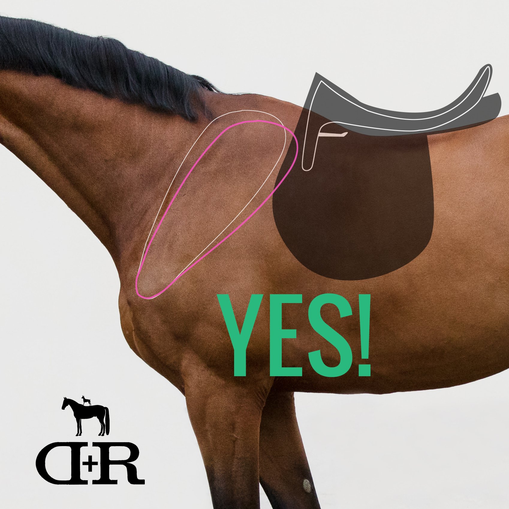
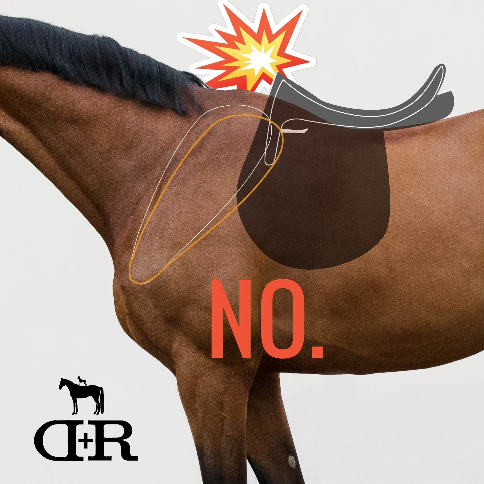


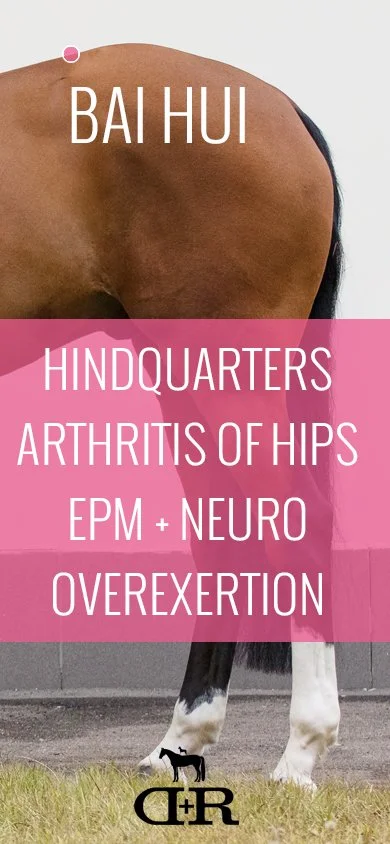
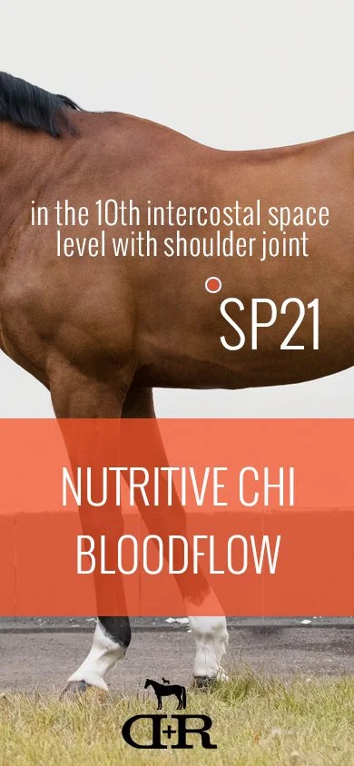

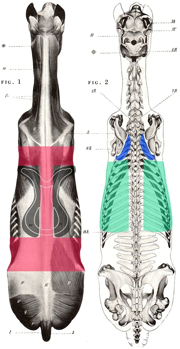
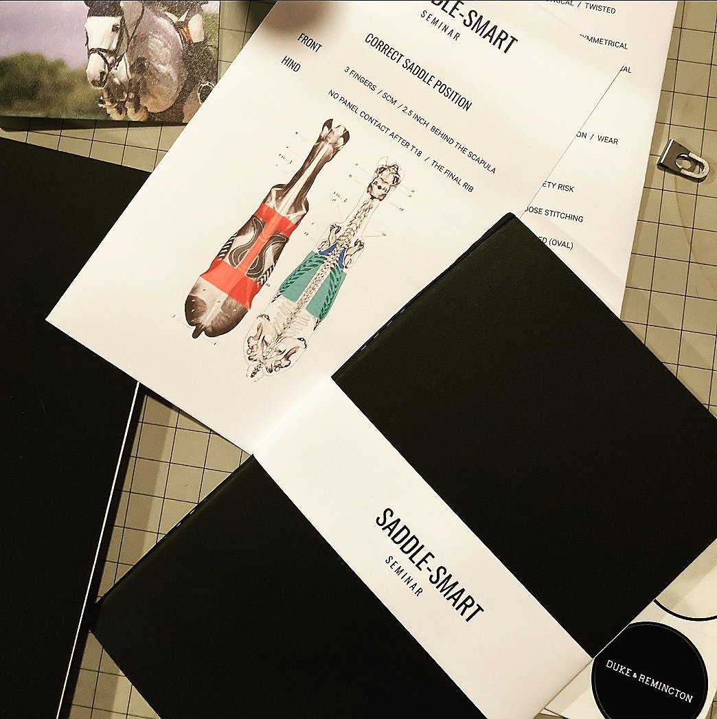
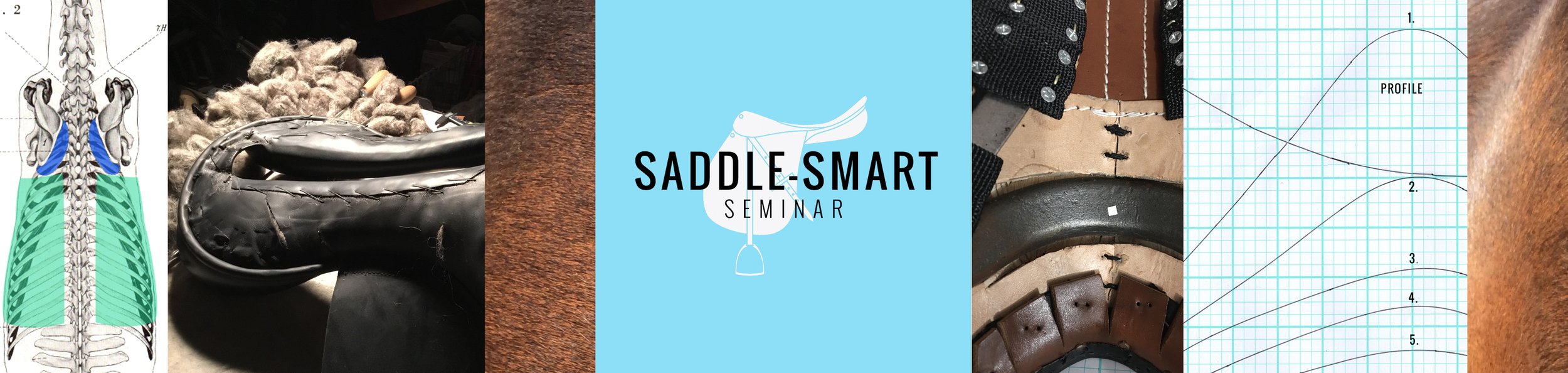
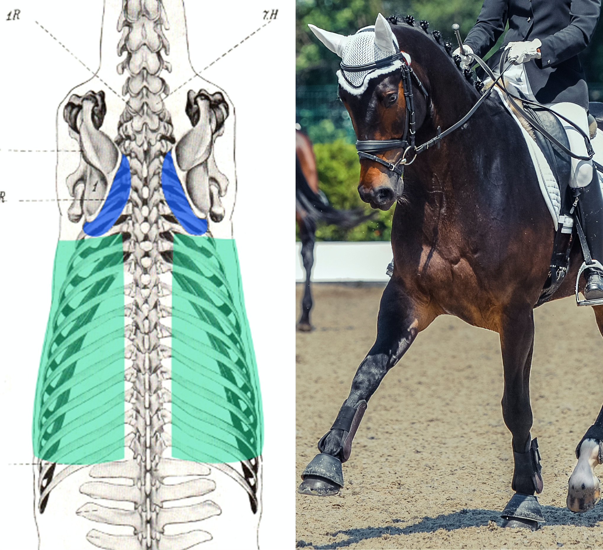
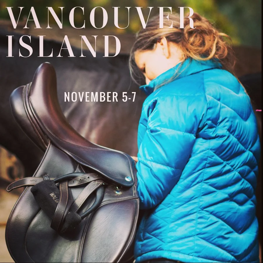
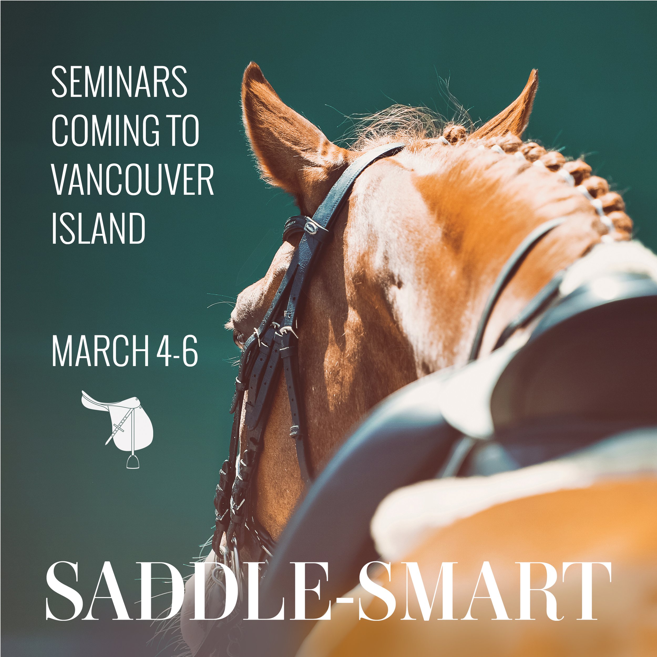
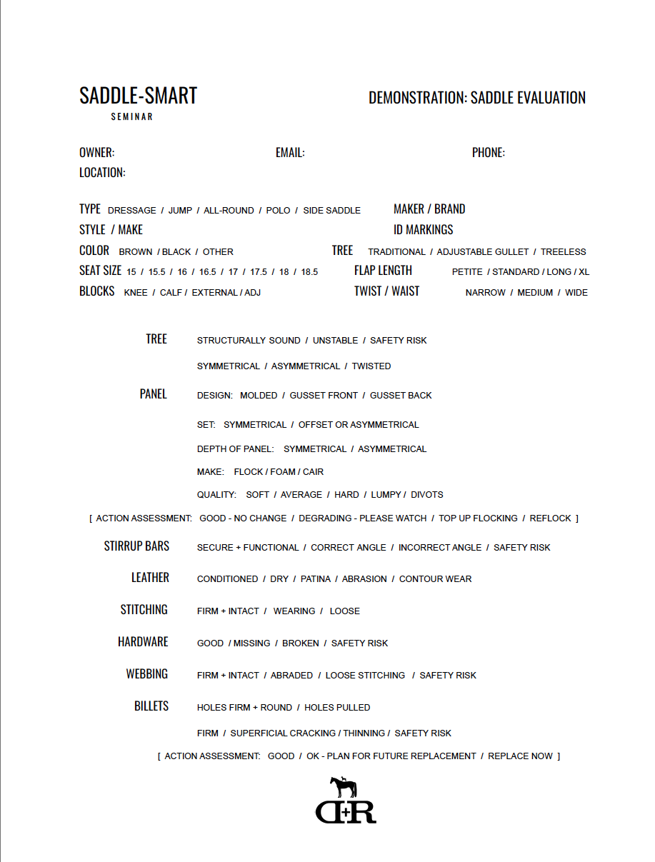
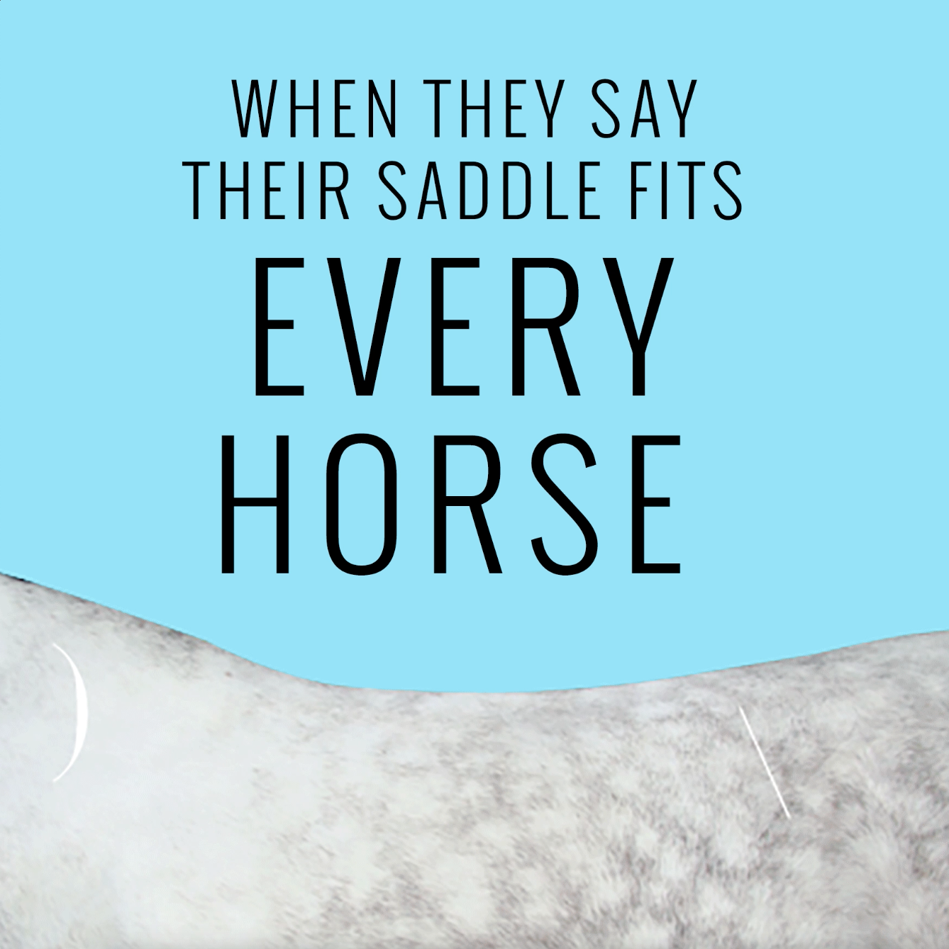
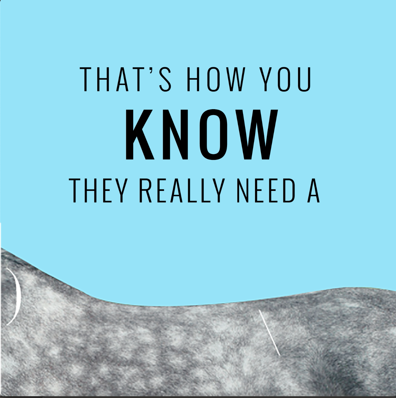
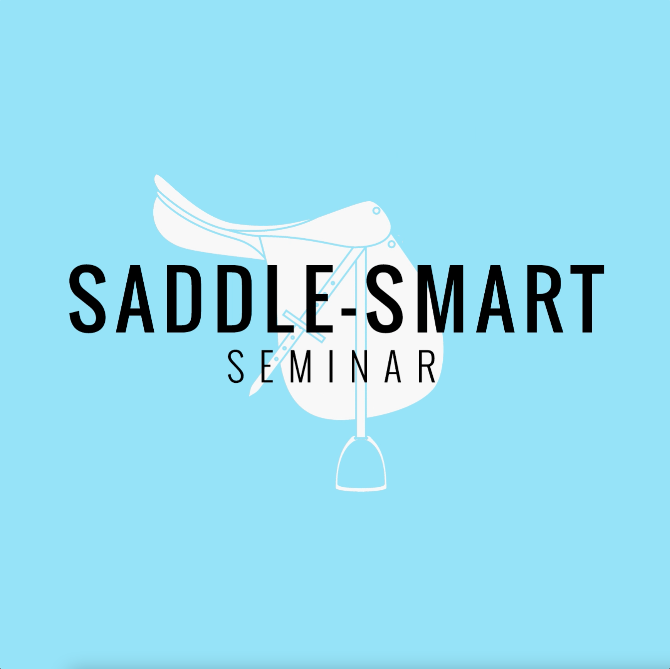
SADDLE SMART
BRANDING / WEBSITE / CURRICULUM / TECHNICAL FORMS / PRINTED BOOKLET / ILLUSTRATIONS / SOCIAL PROMOS
dukeandremington.com/saddle-smart
Saddle-Smart is a saddle-fitting program designed to help equestrians, trainers, and equine wellness professional better understand saddle fit issues.
Created to empower equestrians, the curriculum shares the knowledge you need to make well-informed saddle decisions for you and your horse. From horse anatomy to saddle design, functional movement, and how to spot saddle problems early, Saddle-Smart shares the information and tools you need to help you achieve the perfect fit.
Both seminars and an online intensive for distance learners are offered through the Duke & Remington website.


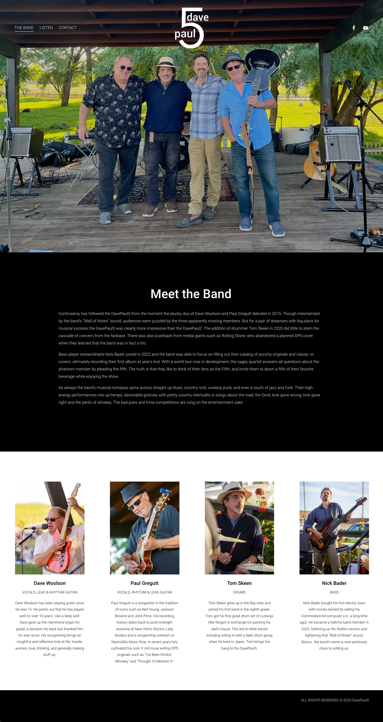
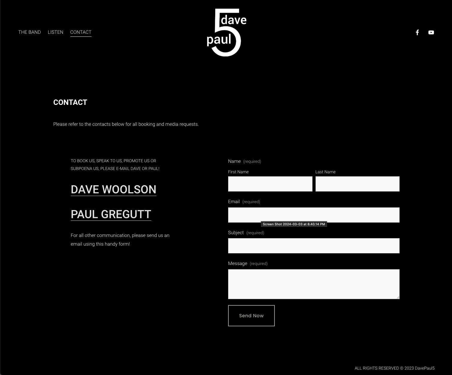
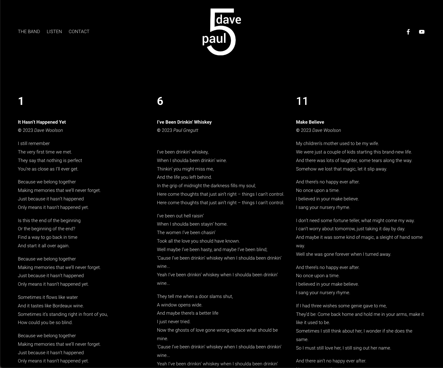
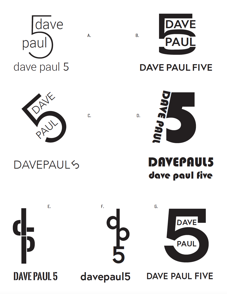
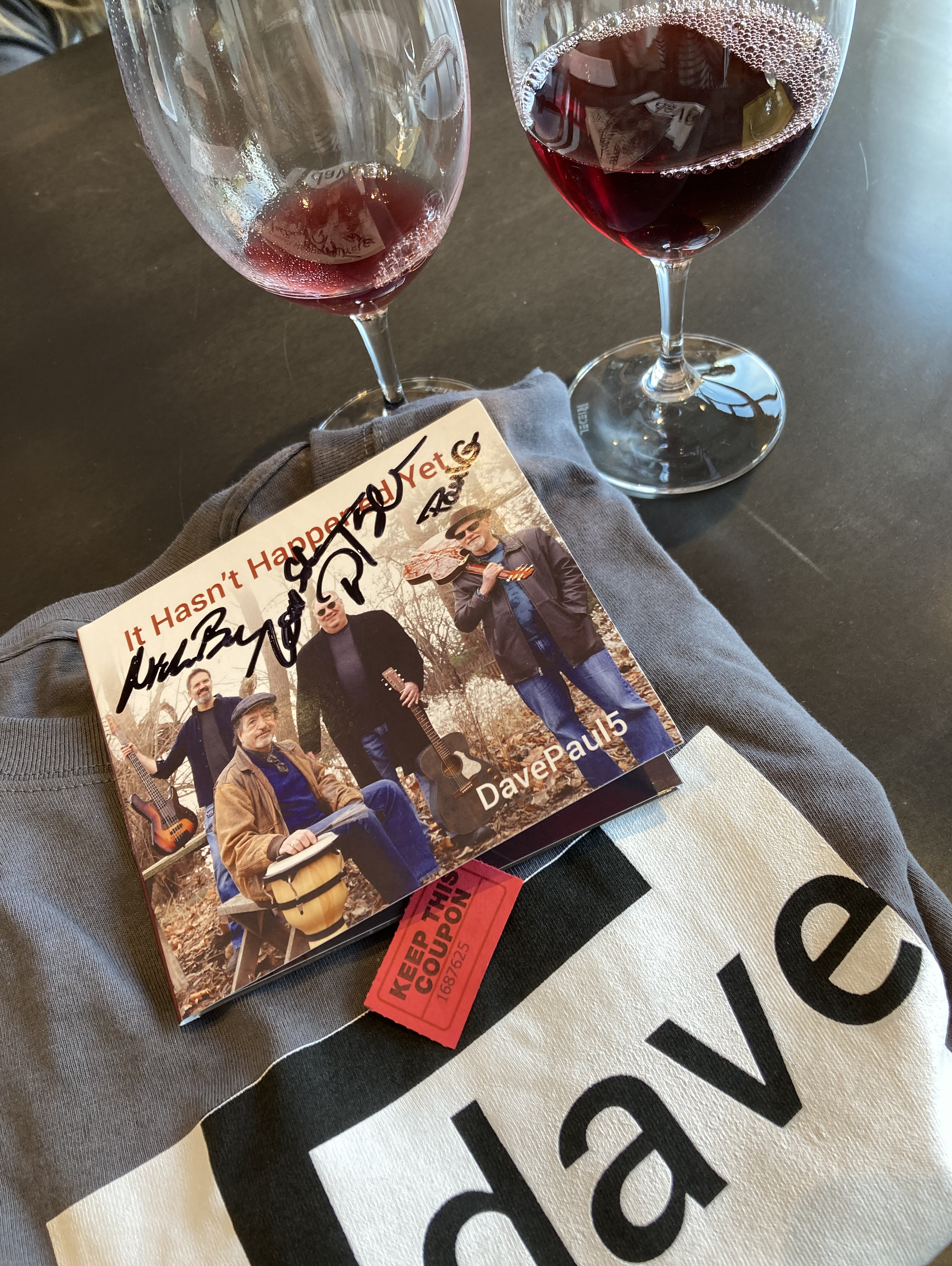
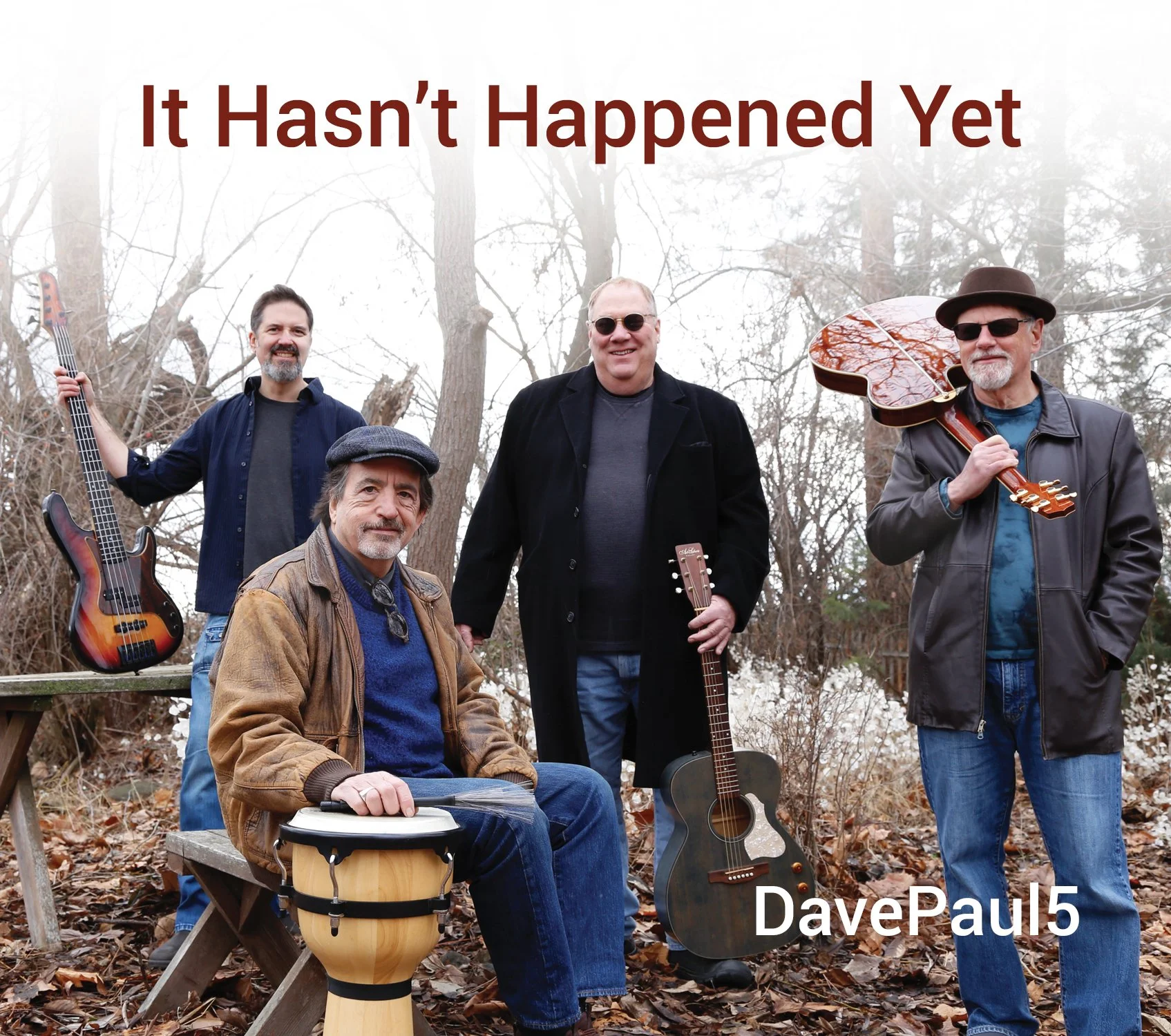
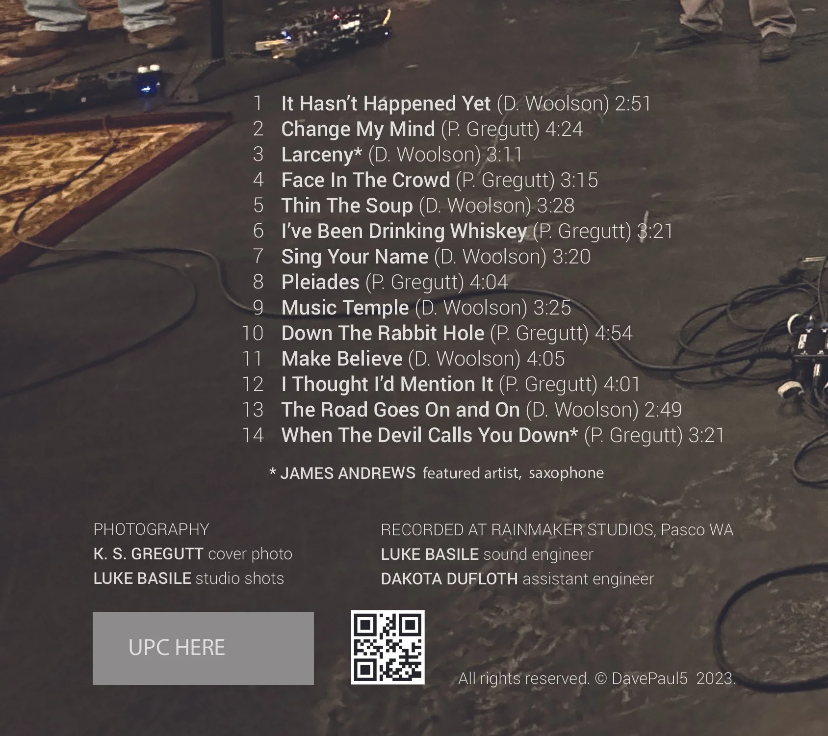
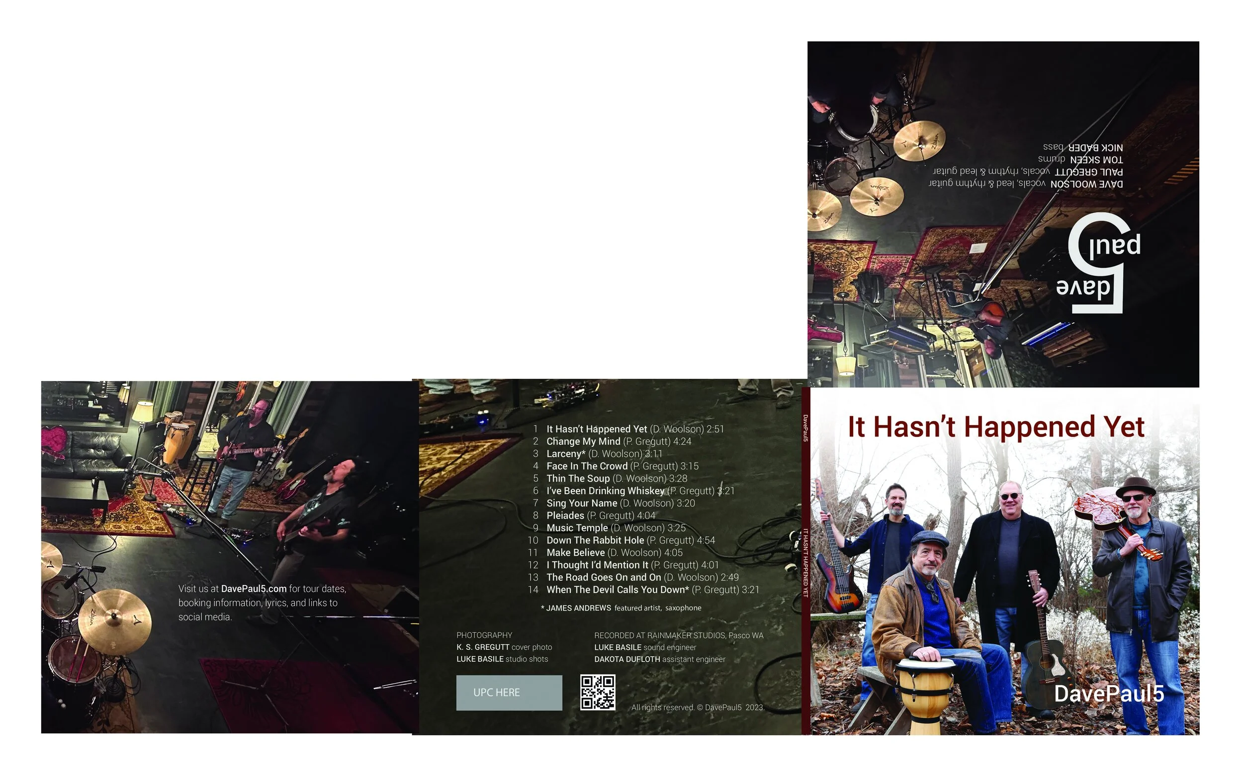
DAVEPAUL 5
BRANDING / WEBSITE / CD / INITIAL WEBSITE
davepaul5.com
Every graphic designer should have the fun of working for a band at some point in their career. With four independent visions of how they wish to put their identity forward, the banter and negotiations on DavePaul 5’s CD and website project was epic.
The cover photography was shot by Paul’s wife, and the CD case interior shot by the recording studio, so the colors and textures of those images dictated the CD art palette. Provided with a doodle sketch from a band member, the logo was an exploration on theme.
As an active gigging band in the Walla Walla area, particularly with wineries and downtown venues, the website was designed to introduce the band, allow visitors to listen to snippets of their CD tracks, encourage contact from booking agents, and publish the lyrics from It Hasn’t Happened Yet.
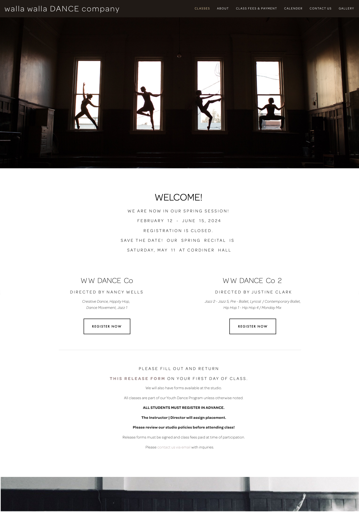
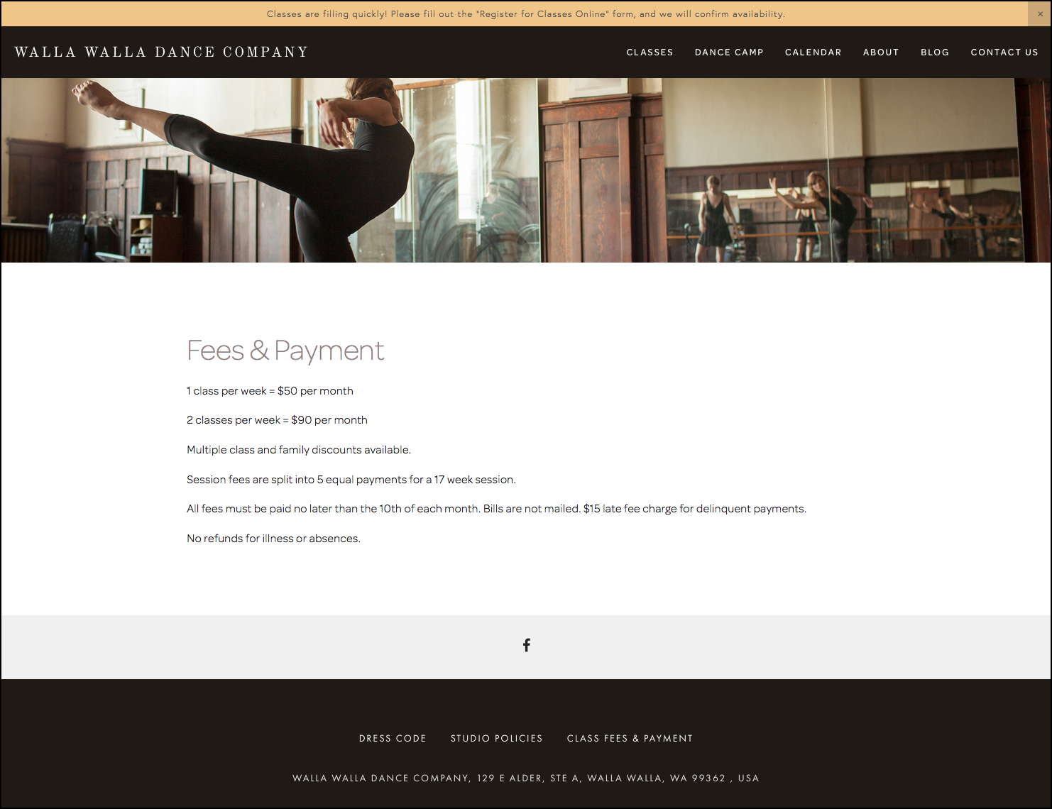
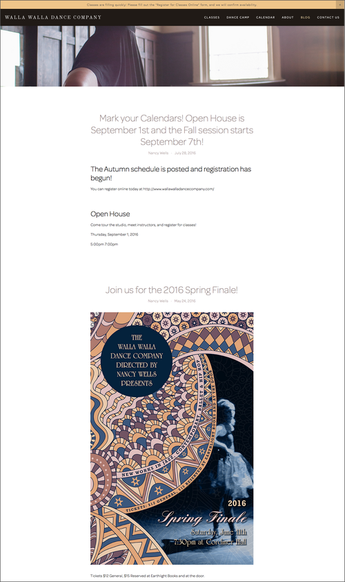
WALLA WALLA DANCE COMPANY
WEBSITE BUILD / COPY / GOOGLE BUSINESS / SYSTEMS
wallawalladancecompany.com
Walla Walla Dance Company provides an array of classes for students of all ages. Their hard work culminates in two annual performances which are popular community events. Originally built 5+ years ago, we recently did a recent refresh to reflect an expansion of the team.
The original focus was to migrate off of an old outdated platform, display class offerings and to improve communication channels for the many parents who the client interacts with every day. The client, being a self-proclaimed luddite, needed everything to be technologically simple and easy to manage from her phone. We leveraged auto-publishing of the blog out to the Facebook page, created contact forms which would put messages in the client's e-mail inbox while adding protection from spam abuse, and cleaned up some old bad data on Google Maps to ensure the studio was easy to find. The wide array of classes and dance camps can now be registered for online, and the web form delivers directly to the client's e-mail inbox. The mobile experience for moms-on-the-go is top notch, preventing unnecessary contacts.
The beautiful image content was shot by photographer Roark Nelson and captures the feel of the studio environment perfectly.


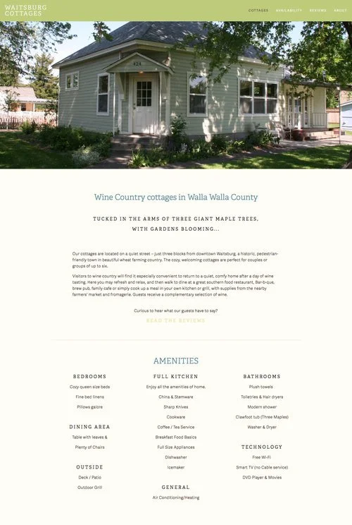
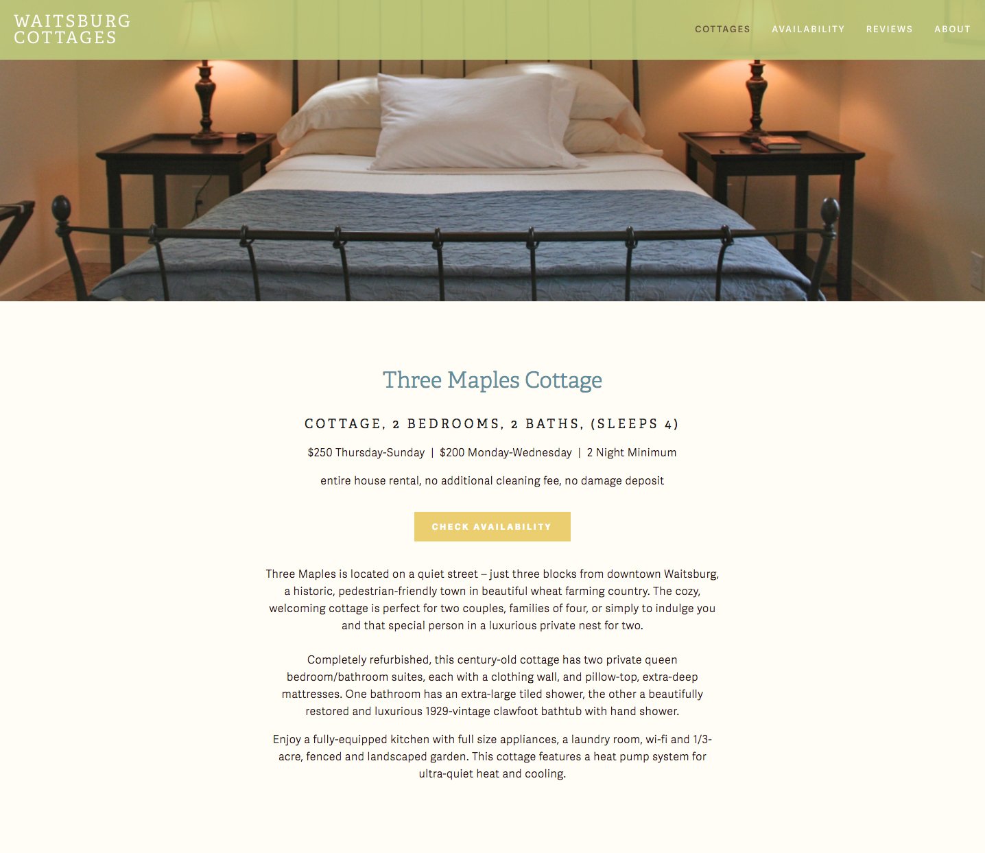
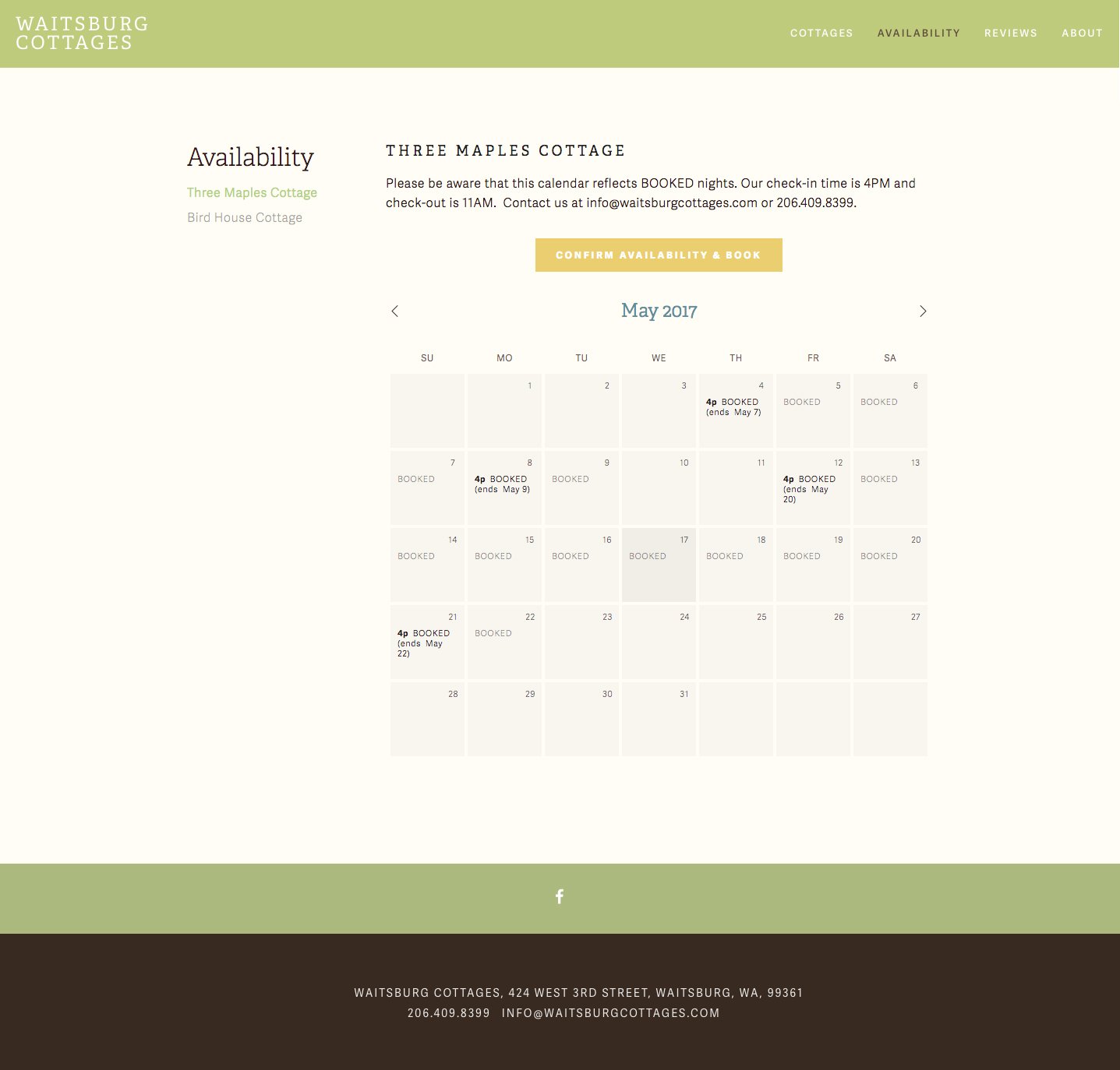
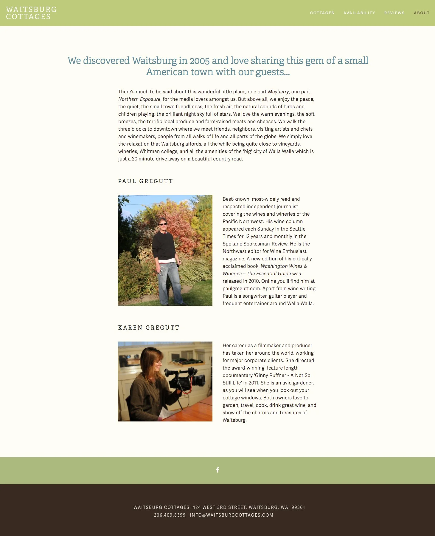
WAITSBURG COTTAGES
WEBSITE
Waitsburg Cottages was a collection of lovingly restored vacation rental properties owned and managed by filmmaker and artist Karen Gregutt and wine writer Paul Gregutt in Waitsburg Washington. Every detail of these cosy cottages was considered for the comfort of the guests.
The website was designed to showcase the properties and to make reviewing availability a snap. With the owners preferring a person-to-person booking experience, the online form delivered contacts directly to the owner's mobile devices, so they could respond rapidly and manage bookings from wherever they may be.


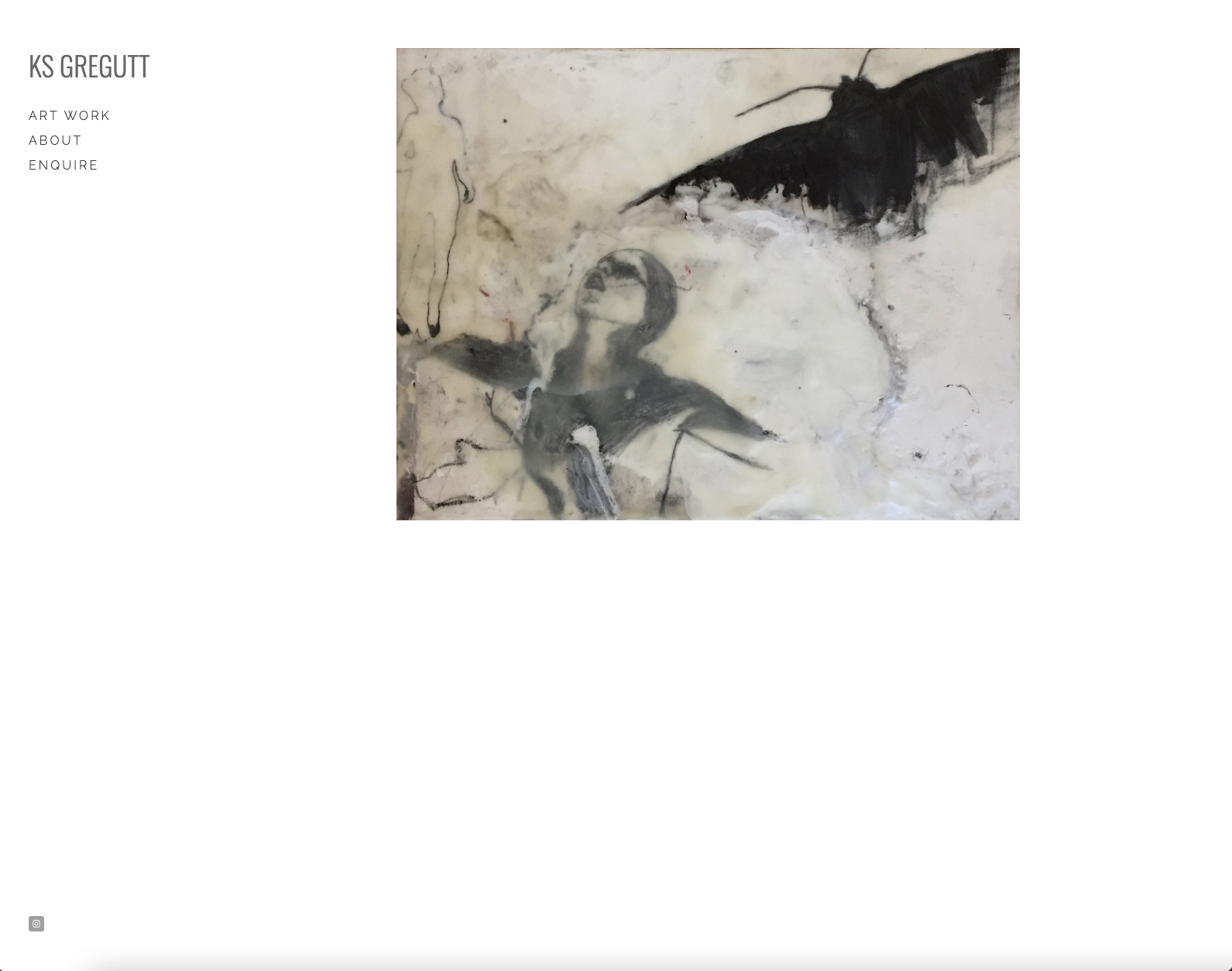
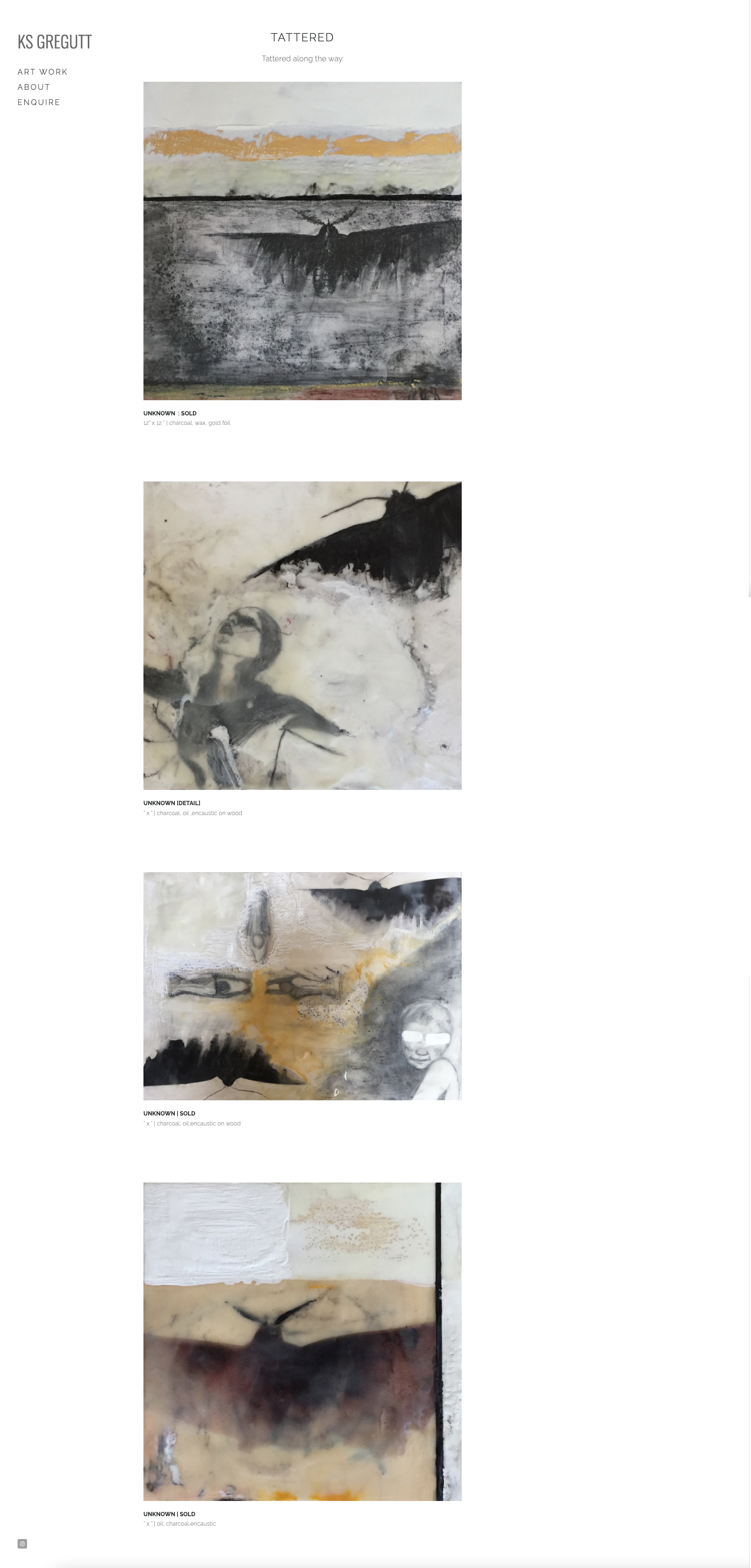
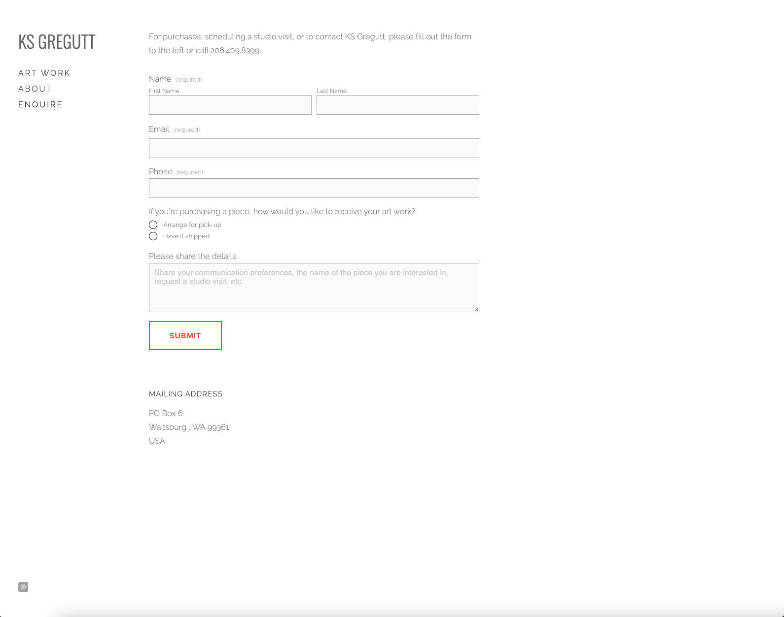
K S GREGUTT
WEBSITE / DIGITAL IMAGING
ksgregutt.com
This minimalist website was designed for artist K S Gregutt. Her request was for simple navigation, clean UI focused on displaying the art in as close to an art gallery as the digital boundaries would allow.
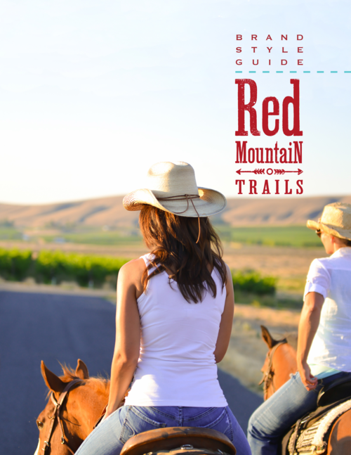
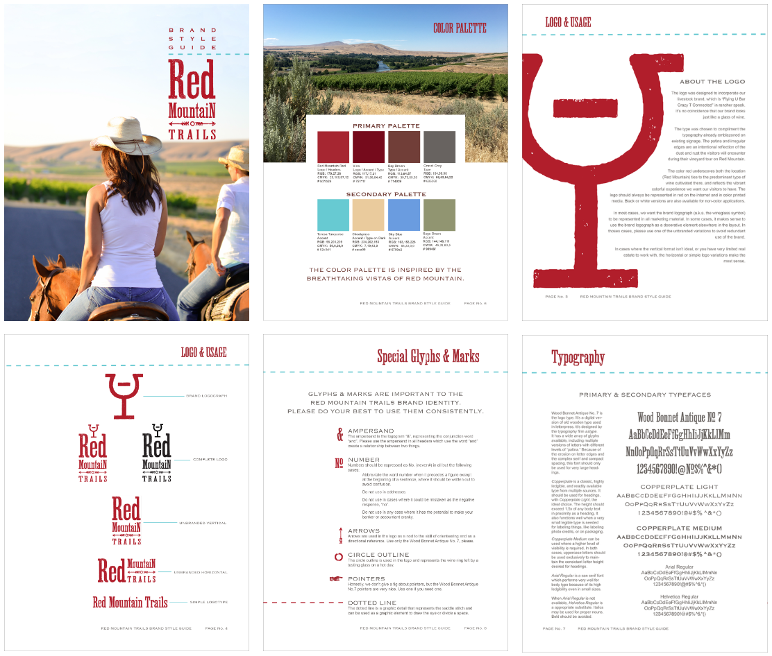
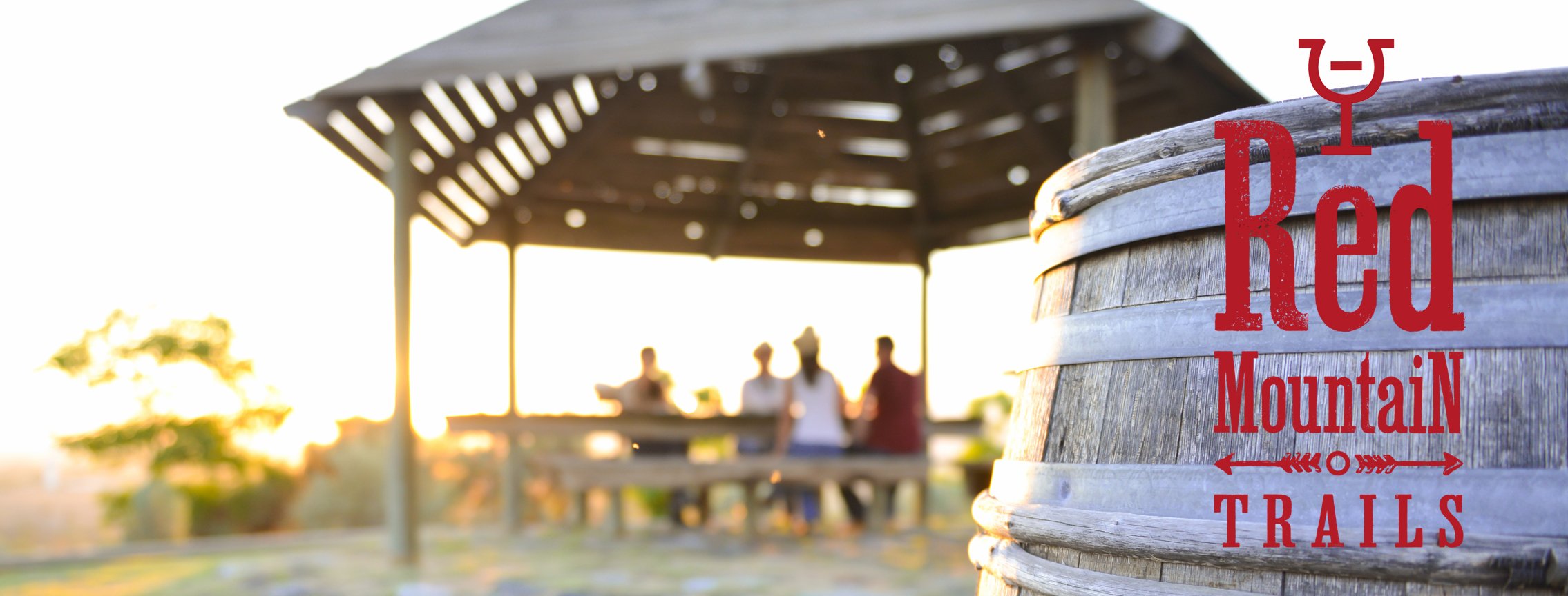
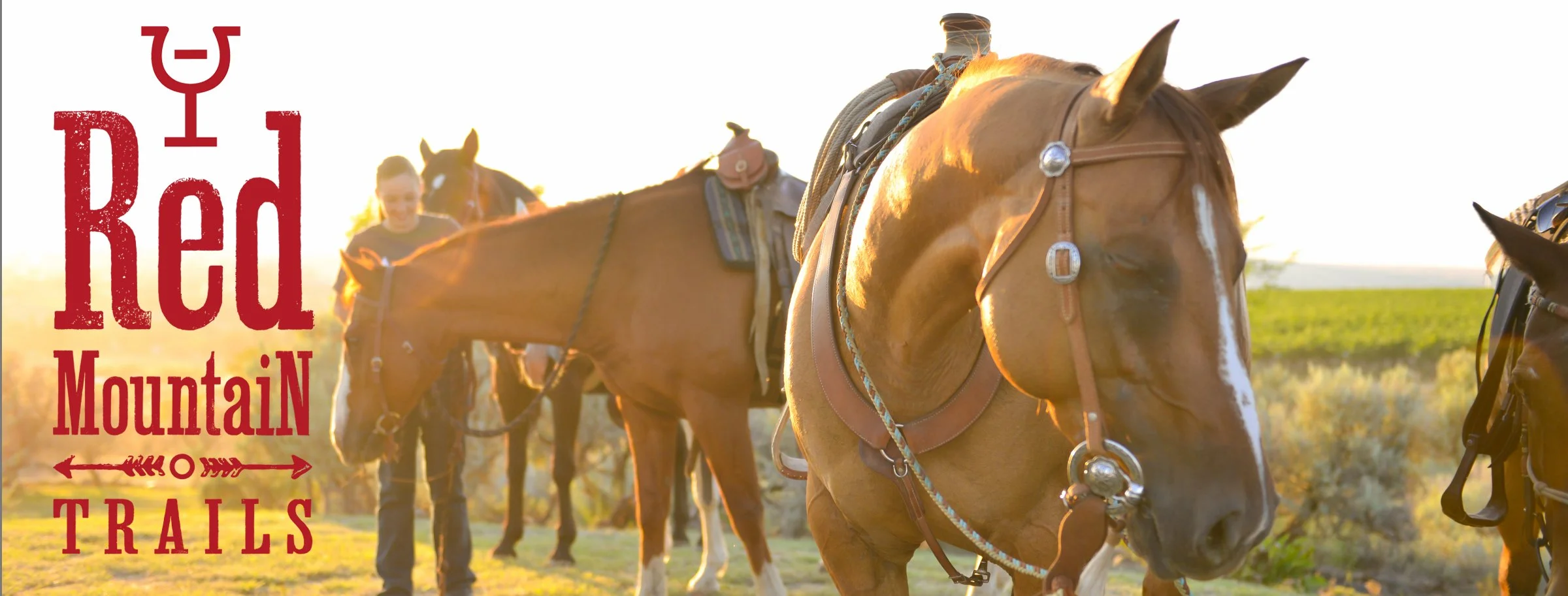
RED MOUNTAIN TRAILS
BRANDING PROJECT
Red Mountain Trails is a company that offers vineyard excursions on horseback, bikes, or horse-drawn wagon, as well as seasonal sunset dining events, and wine tasting at local wineries. After several years of organic growth, the owners decided that it was time for a unified look and feel between various marketing channels.
Originally named for the color of the cheatgrass which used to cover the area, Red Mountain is now wine country. Flourishy script and the prestige branding common to many wineries would be a poor fit for Red Mountain Trails. While the nearby wineries are high quality with mid-price point red wines (Kiona Vineyards, Hedges), the experience being offered is ‘REAL’. Many of the surrounding wineries are in pole barns, agricultural equipment is commonly in use nearby, and there is no shortage of dirt and patina. Both the logo and use of images by MM3 Photography are designed to reflect the experience of Red Mountain Trails.


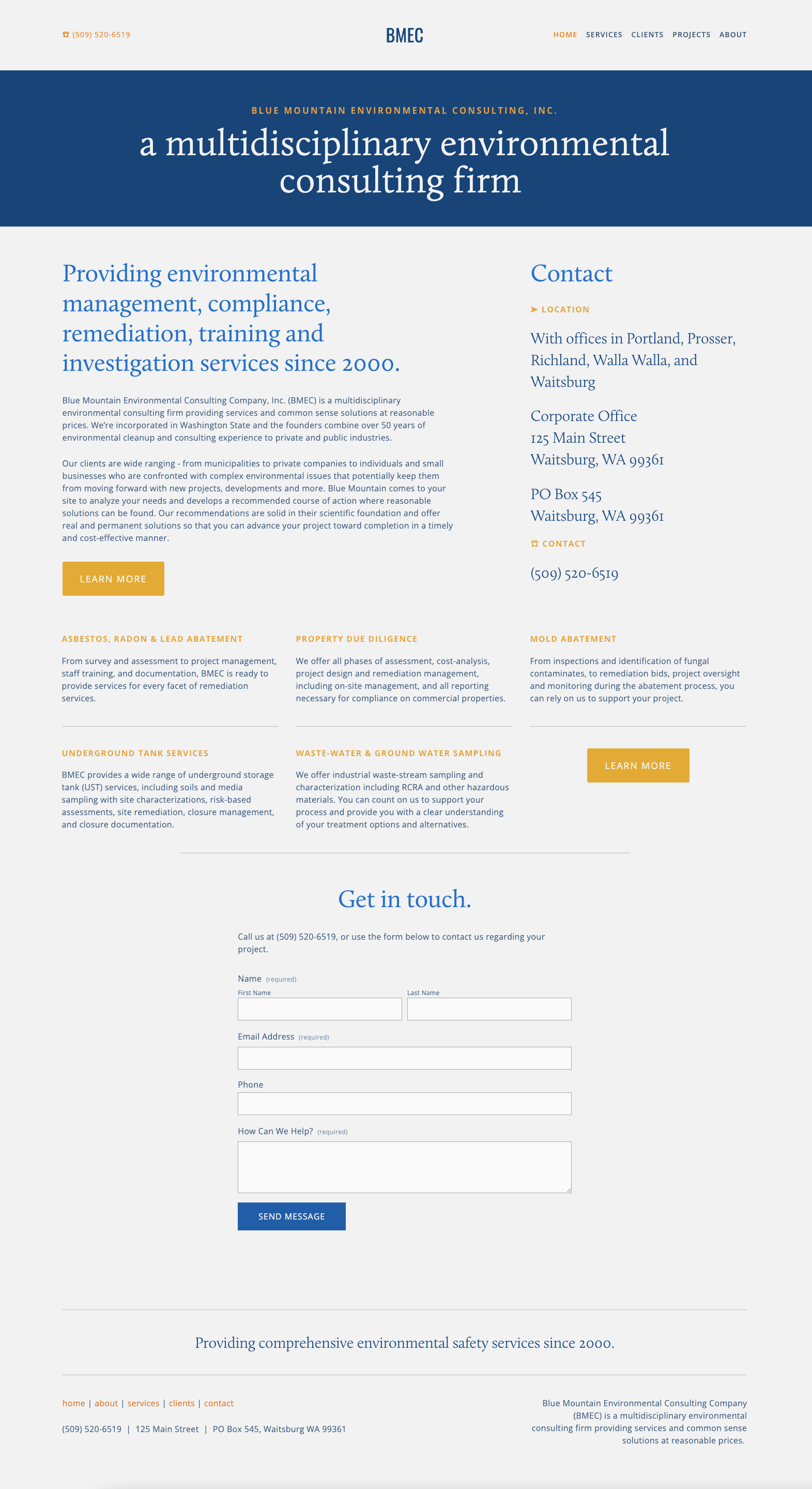
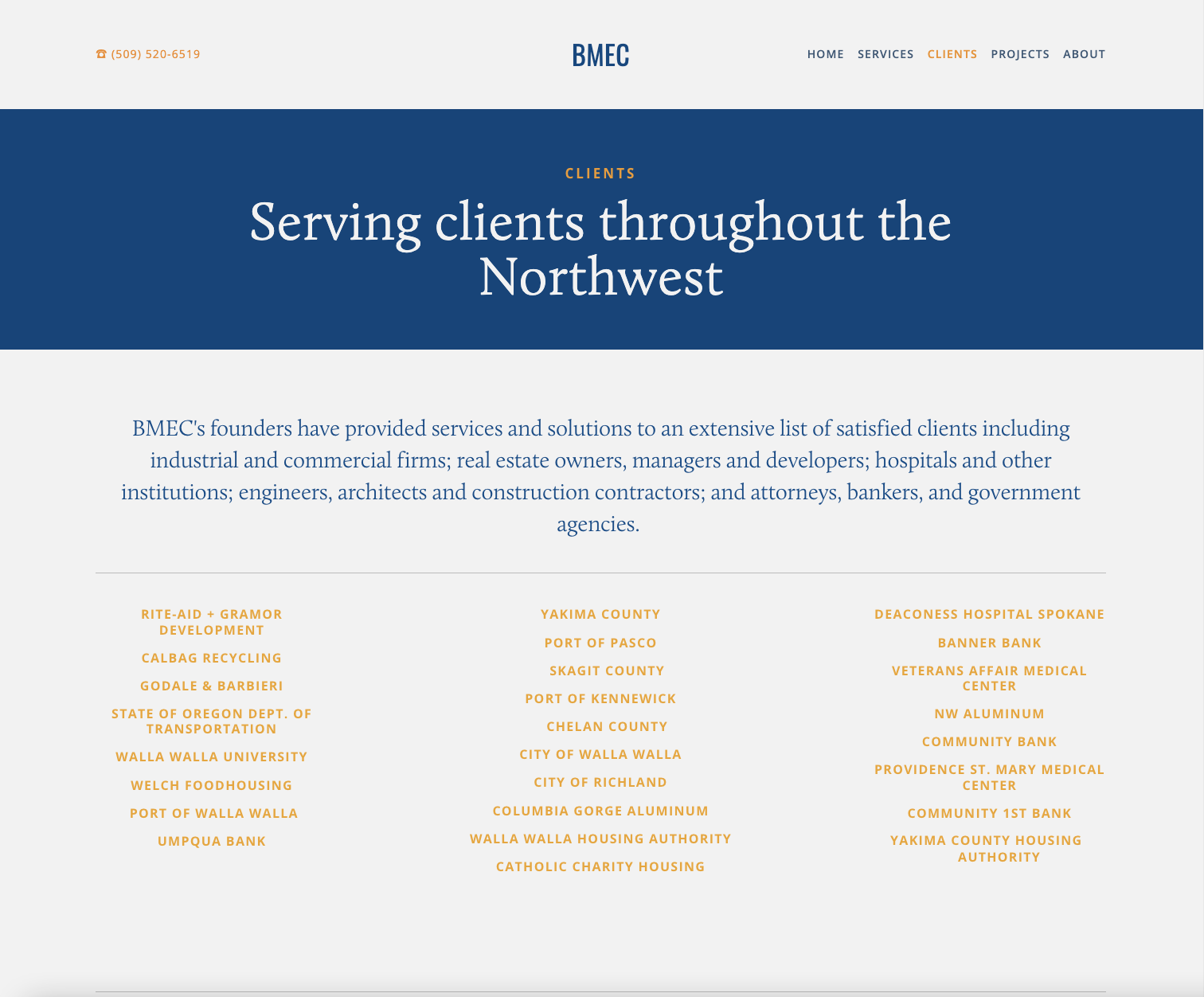
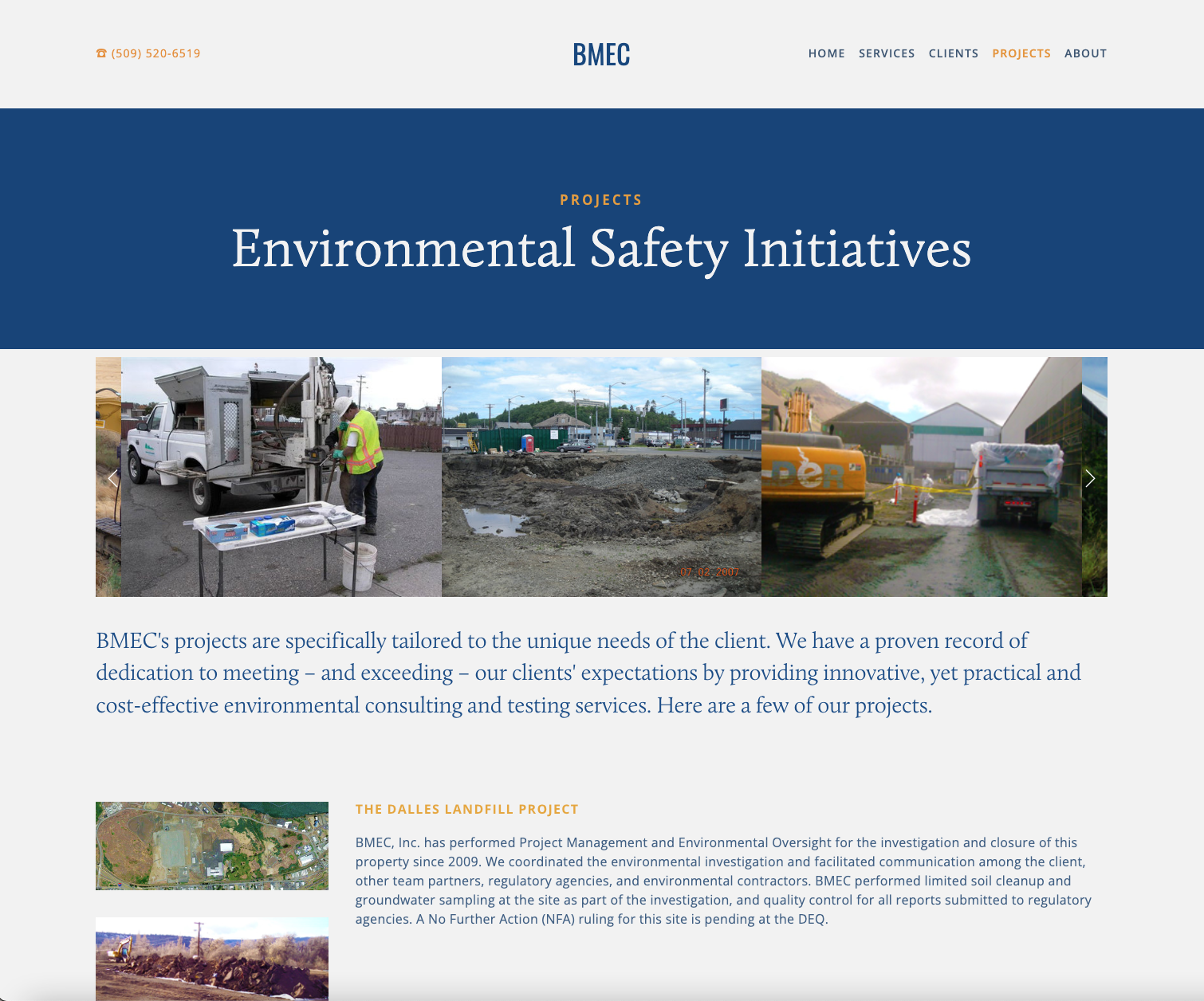
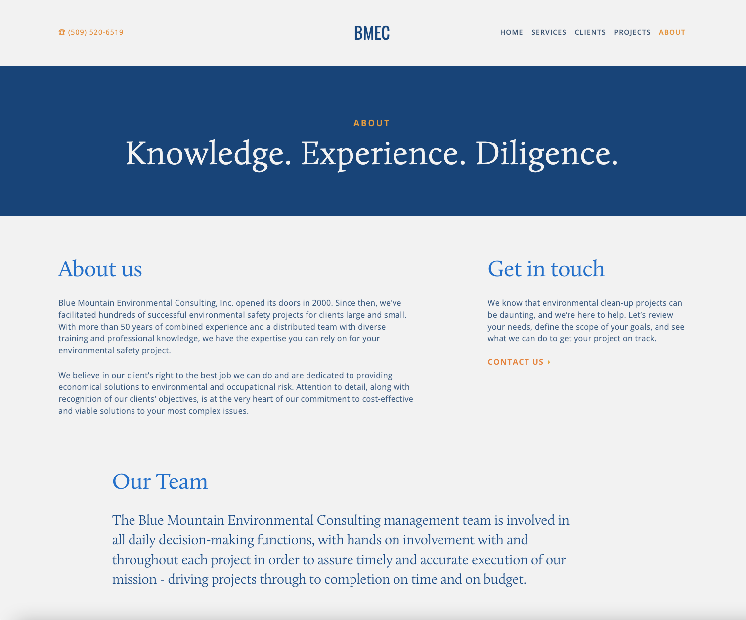
BLUE MOUNTAIN ENVIRONMENTAL CONSULTING
WEBSITE / COPY
bmecinc.com
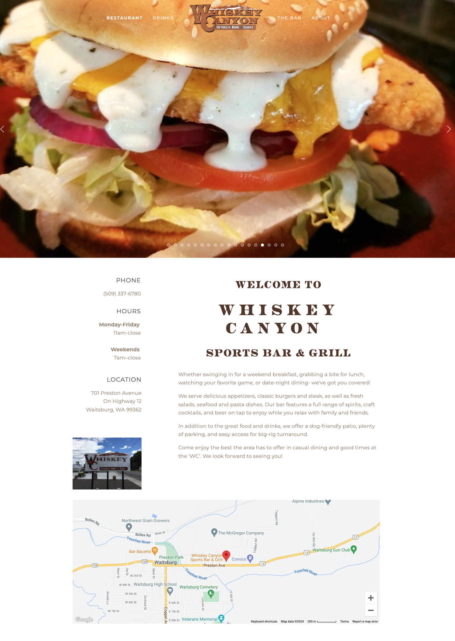
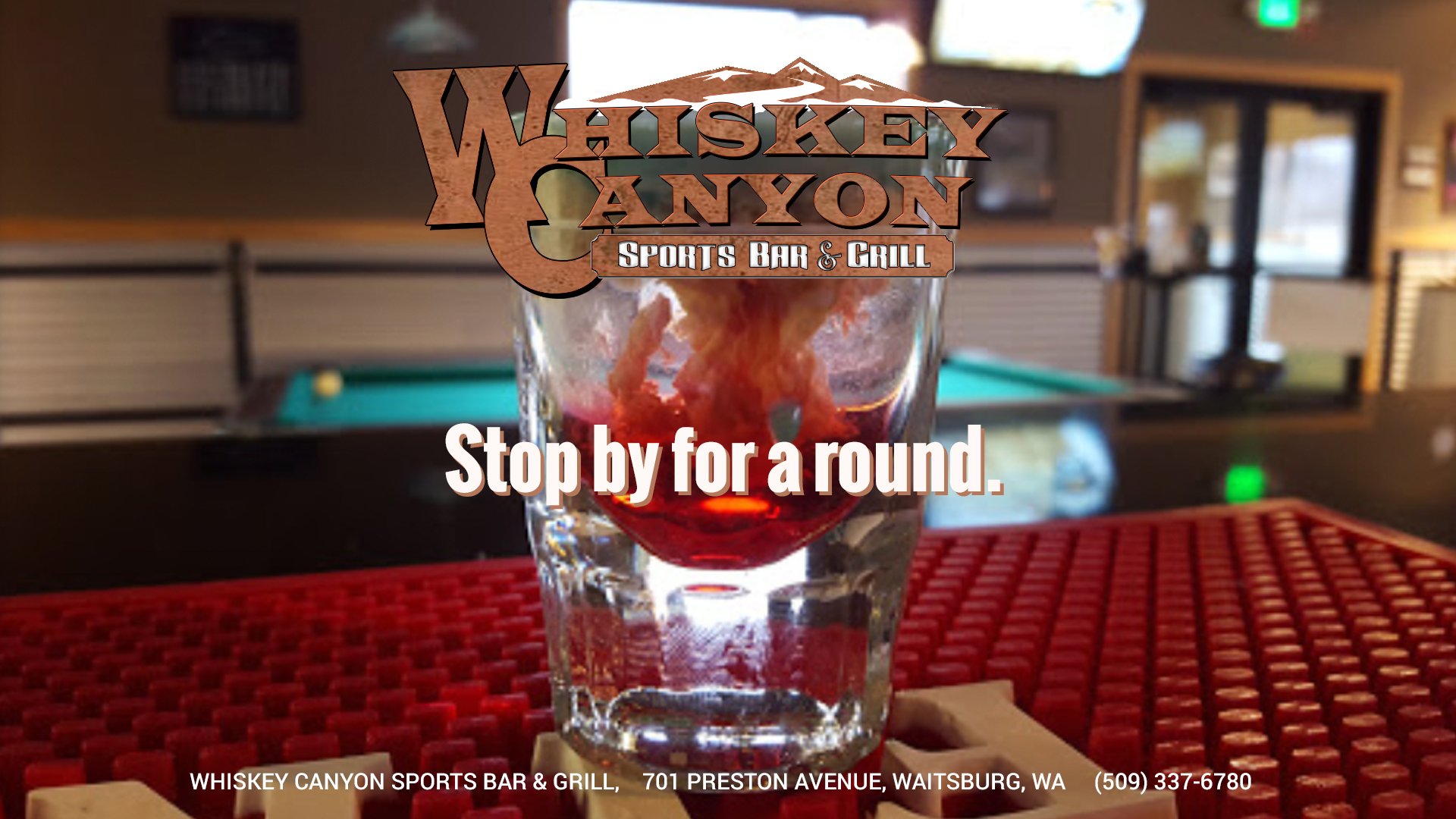
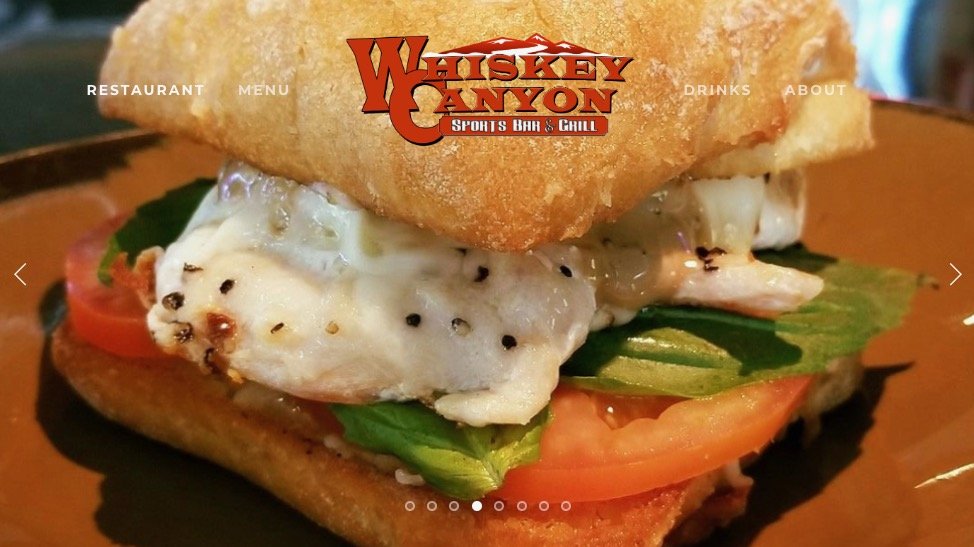
WHISKEY CANYON
WEBSITE / COPY
whiskeycanyonsportsbar.com


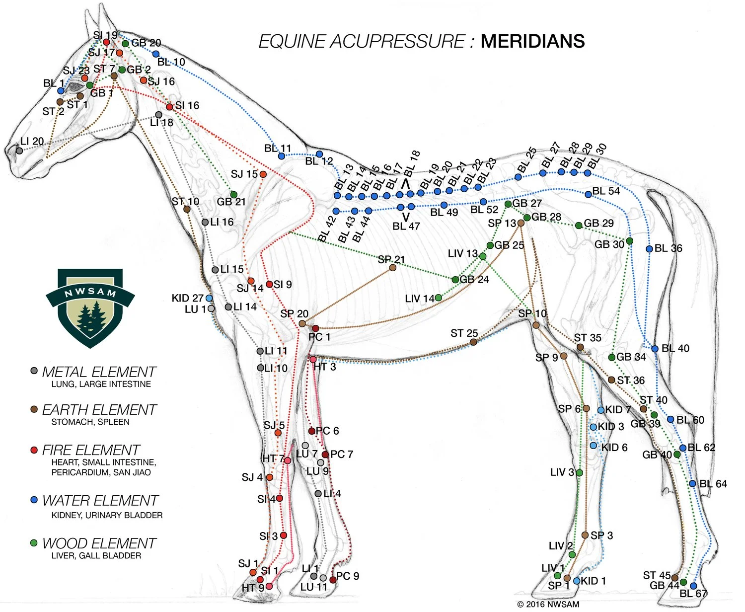
NORTHWEST SCHOOL OF ANIMAL MASSAGE
DIGITAL IMAGING / ILLUSTRATION


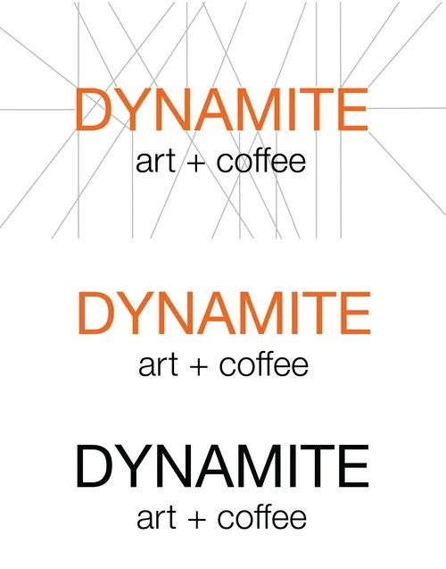
DYNAMITE ART + COFFEE
BRANDING
PRESSROOM CLIENTS SAY
“Suze is an absolute delight to work with. I appreciate her keen eye, attention to detail and awareness of deadlines. I couldn’t be happier with the high quality images she put forth.”
— KIM BAUER, NORTHWEST SCHOOL OF ANIMAL MASSAGE
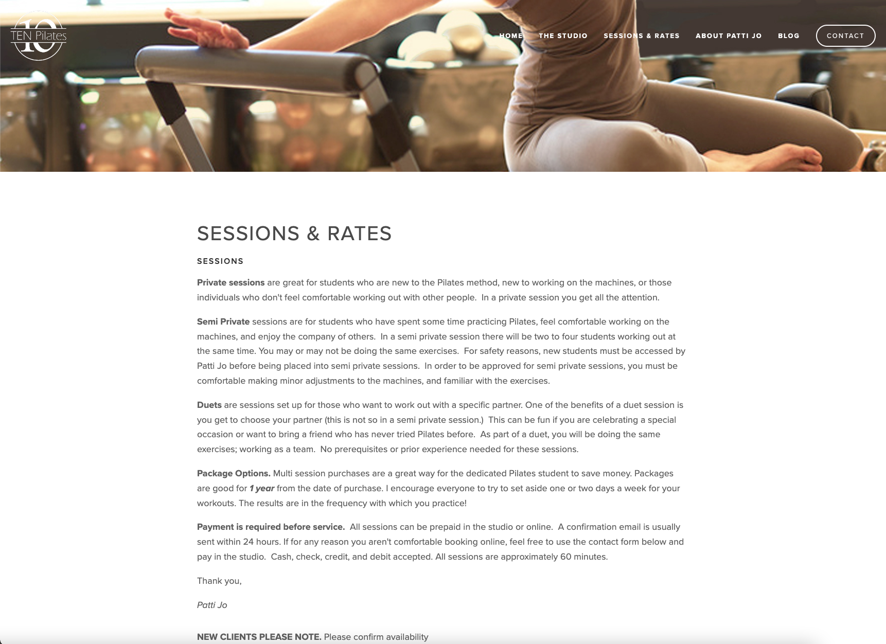
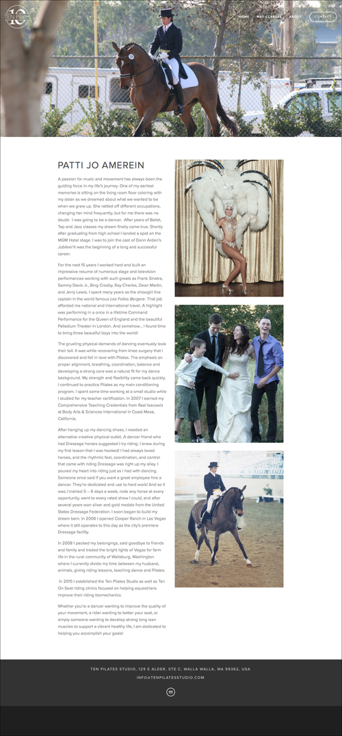
“Being a do-it-yourselfer, I thought I could design my own website. I struggled with it for months. I had a basic idea of what I wanted but just couldn’t nail it down. Then I met Suze. She quickly helped me organize my thoughts and ideas into a concise plan. She was easy to work with: creative, positive, encouraging, open-minded, and a master at gently keeping me on track when I would drift off to creativity land. Within weeks I had a fully functioning, beautiful professional website! I would have never been able to design that on my own. I recommend Suze to everyone!”
— PATTI JO AMEREIN, TEN PILATES STUDIO
“Suze was a great resource for us in refining our company logo. We had the basic idea of what we wanted, and she gave us the expertise we needed to really focus in and nail it down. She also converted our rough files into a useable format that we could take to printers, making our logo actually useable! We couldn’t be more happy with our logo and our experience; thanks, Suze!”
— KELLY STEINHOFF, STEINHOFF CONSTRUCTION
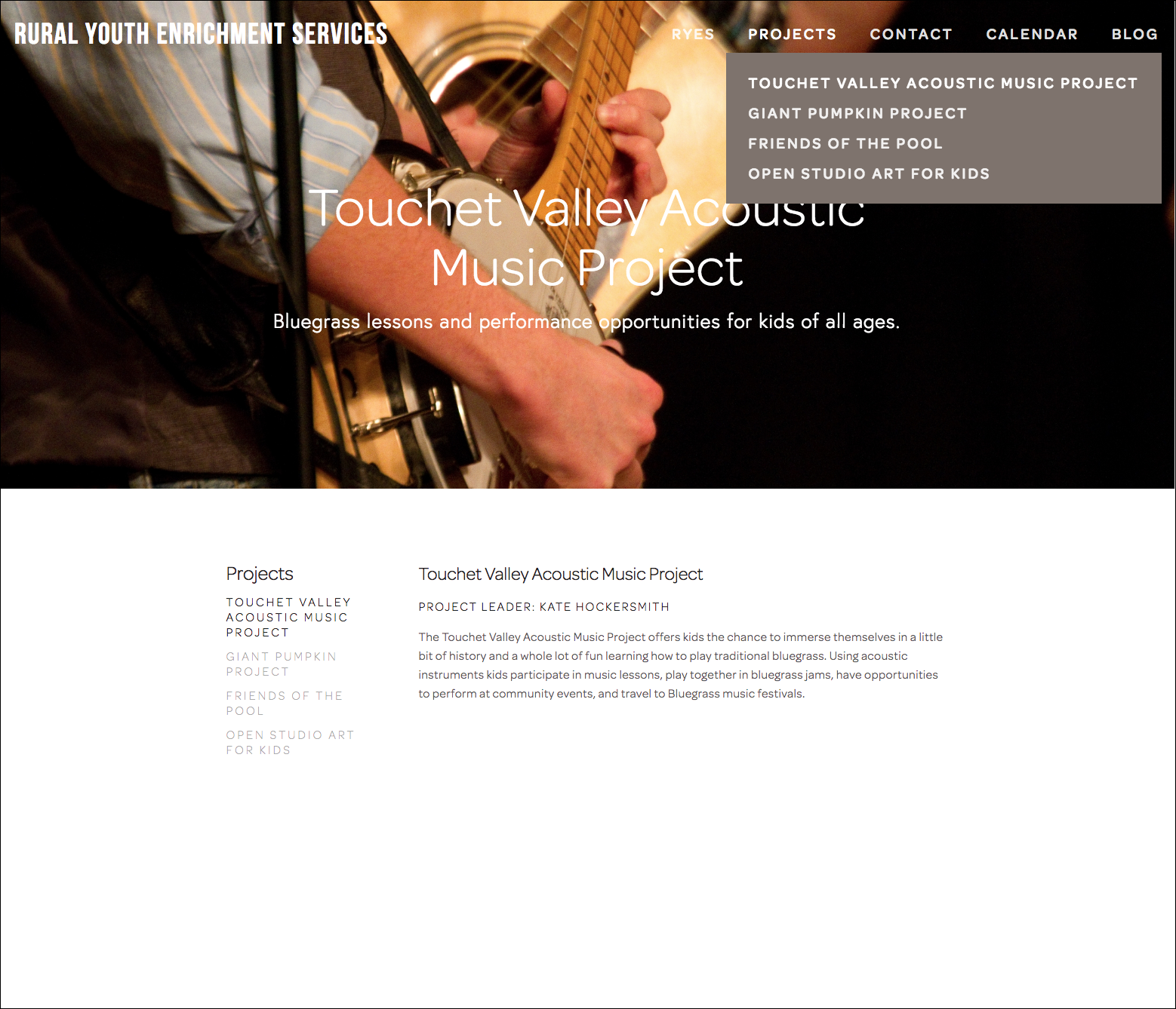
“I just wanted to take a moment to thank you for your help with the Rural Youth Enrichment Services new website. It looks fabulous. Clean, elegant and easy to work with, it’s everything we were looking for. Your eye for design and attention to detail has been *much* appreciated! :-)
I look forward to working with you in the future!”
— KATE HOCKERSMITH, RURAL YOUTH ENRICHMENT SERVICES
“Suze Wood designed my website for The Walla Walla Dance Company and I am very happy with the beautiful work she did. She has a wonderful talent for design and her attention to detail is impressive. I have gotten great feedback and I am really proud of our website!”
— NANCY WELLS, WALLA WALLA DANCE COMPANY
“Suze Wood has outstanding design and tech knowledge. She has been both instrumental as well as delightful to work with on all aspects of my logo design and website for my project Dynamite Art + Coffee. Her focus and listening skills are remarkable. I was able to tell Suze a very rough idea of how I wanted the design to look and feel and she nailed it on the first attempt. Her attention to detail and her overall design sense is thoughtful, refreshing and dynamic. ”
— CLAIRE JOHNSON, DYNAMITE ART + COFFEE